The Flames
Re-igniting an iconic NHL franchise.
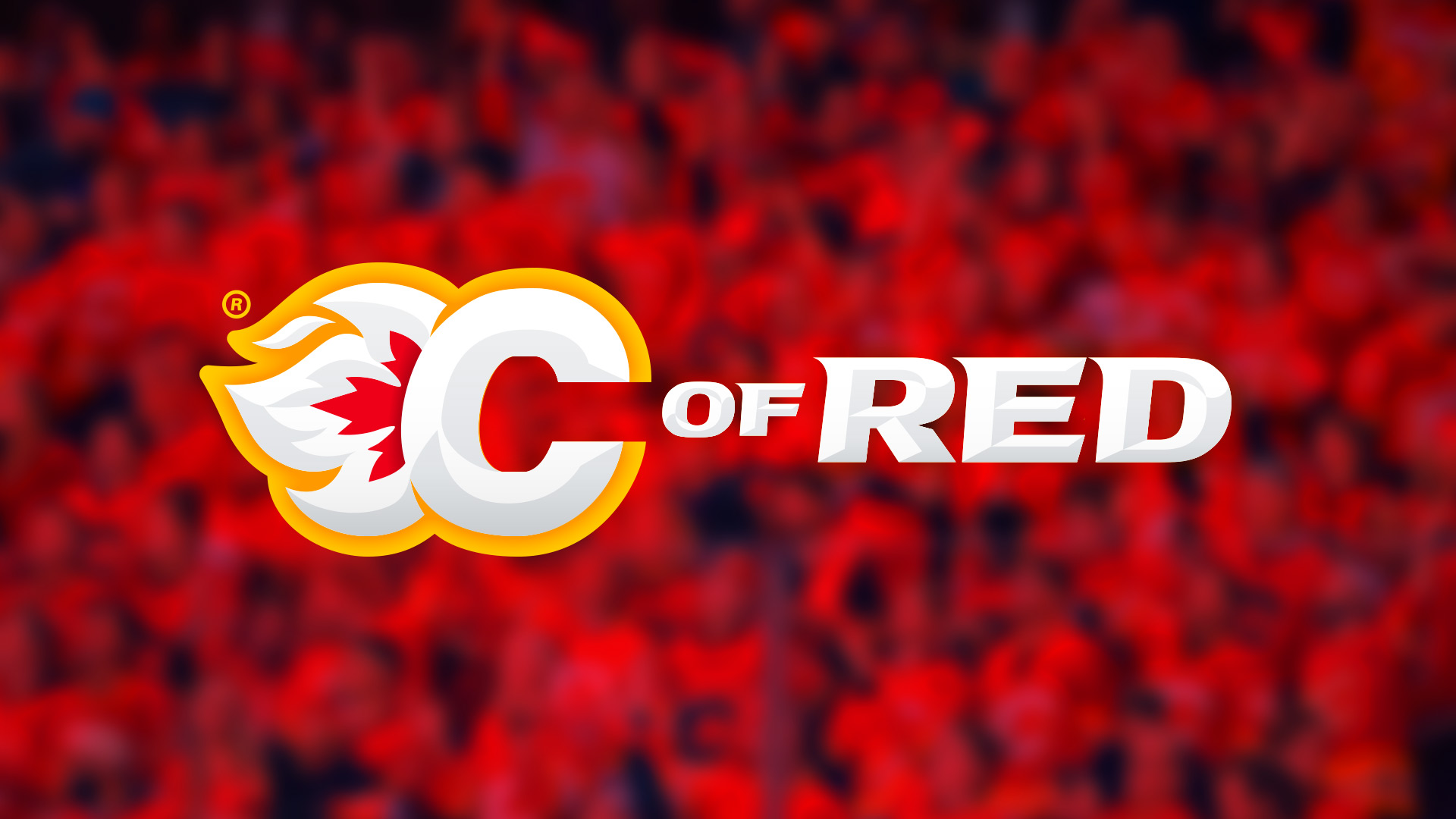
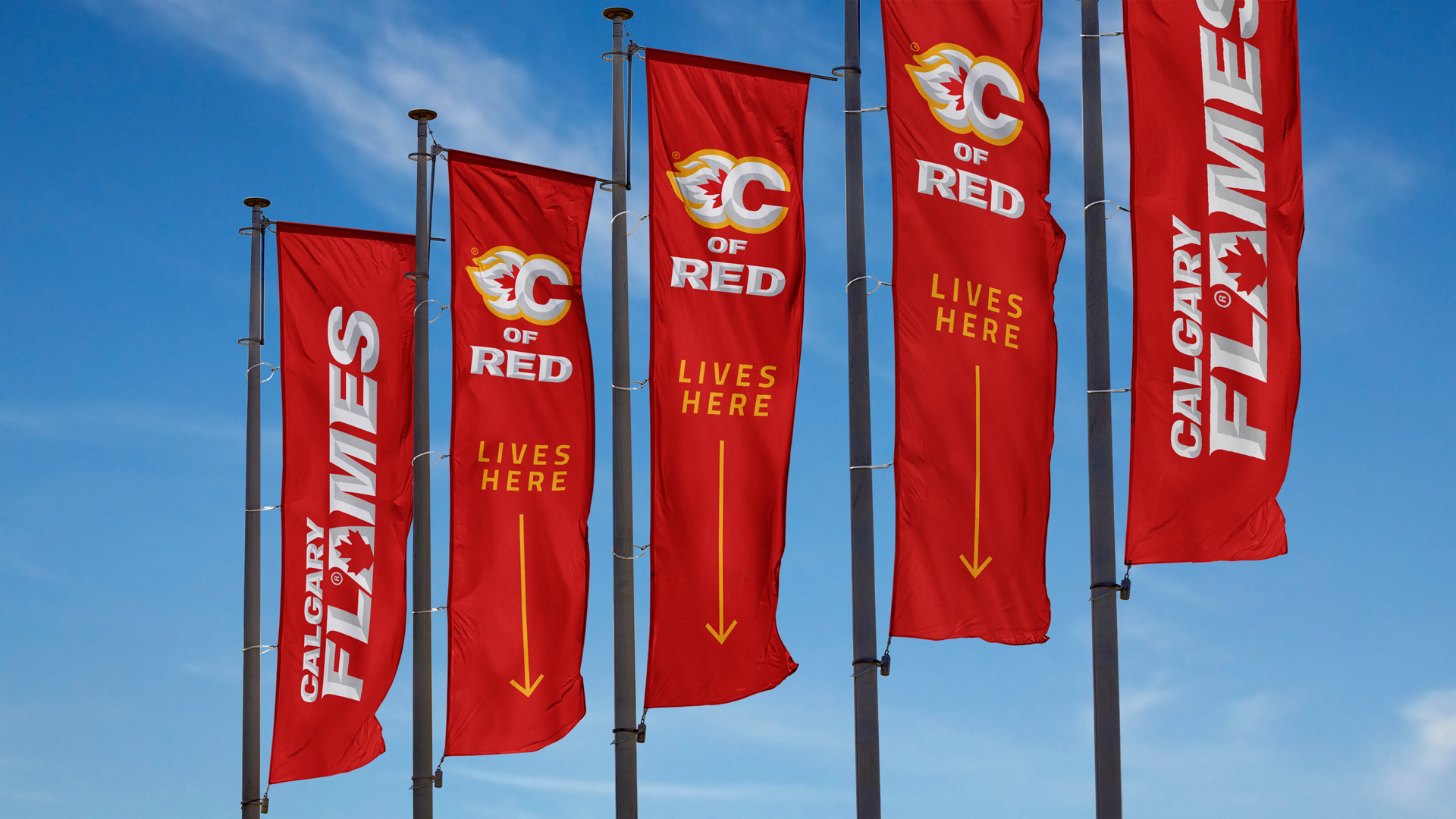
The Calgary Flames are an NHL ice hockey team. Whilst they have only won a single Stanley Cup, they do possess that rarest commodity in North American franchise sports… a devoted fan base (the ‘C of Red’).
A passion project, born out of adoration for the ‘C of Red’, hockey and my years in Canada.
- Client
- Calgary Flames (on spec)
- Sector
- NHL / Ice Hockey / Sports Franchise
- Services
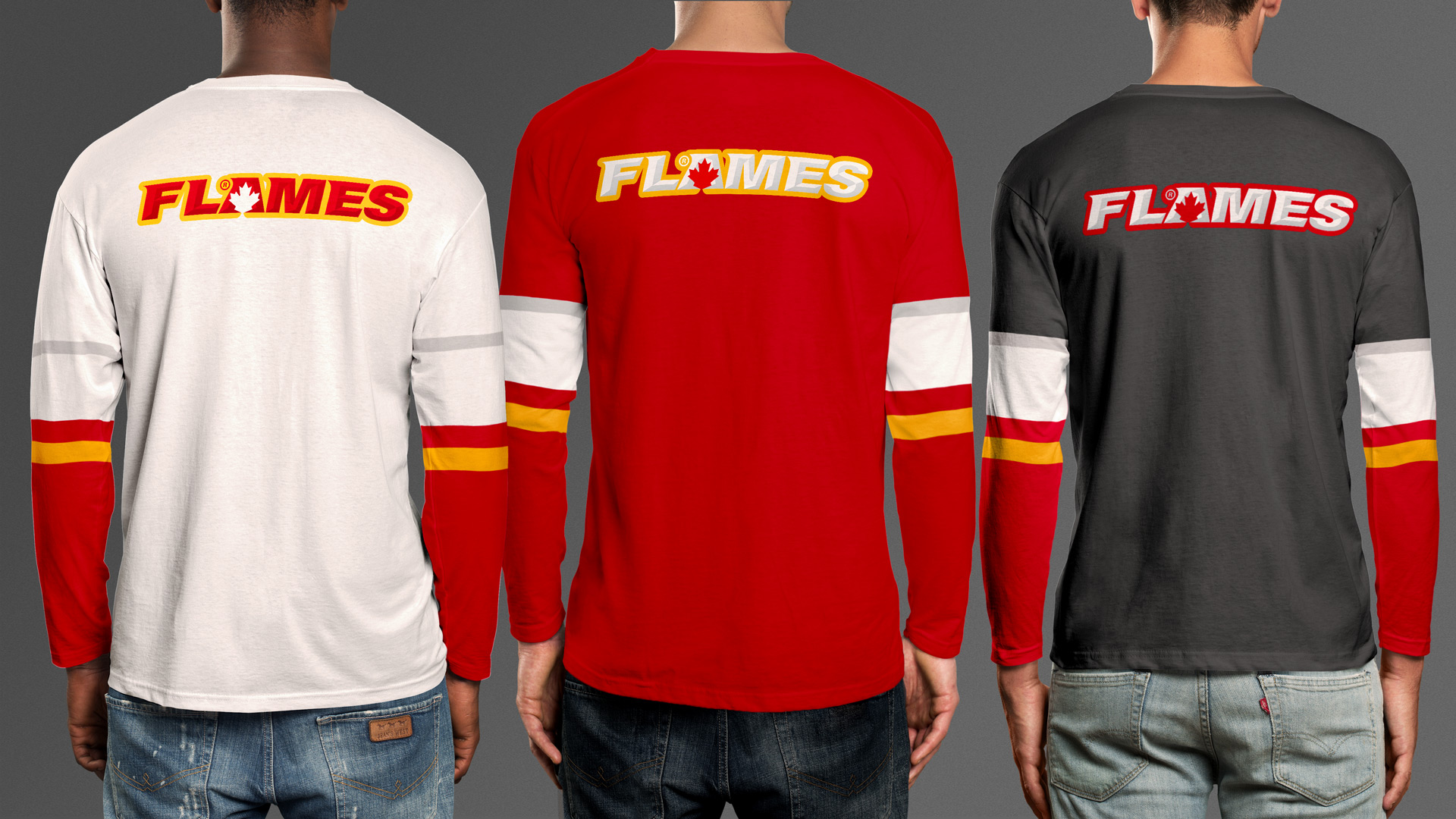
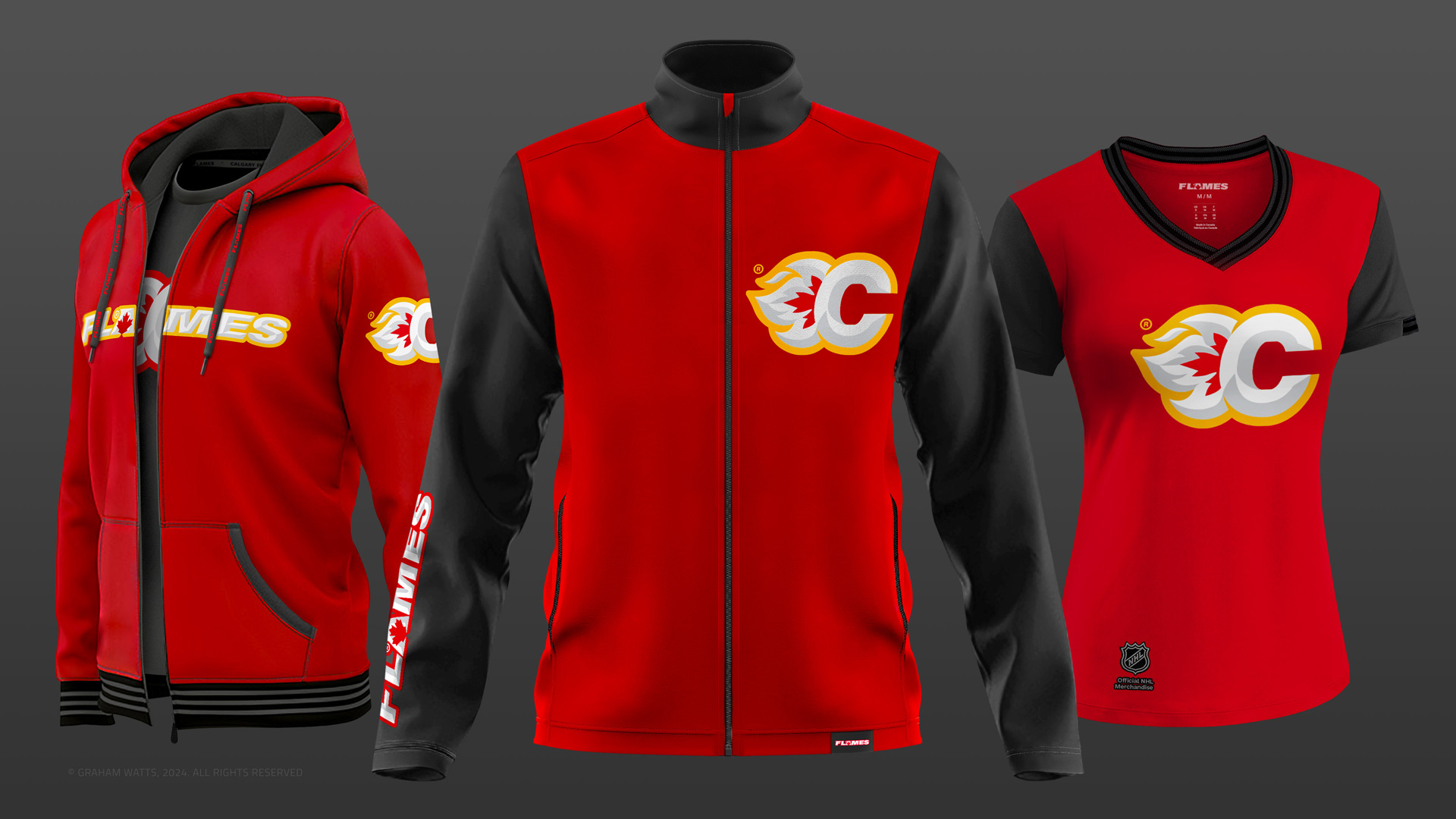
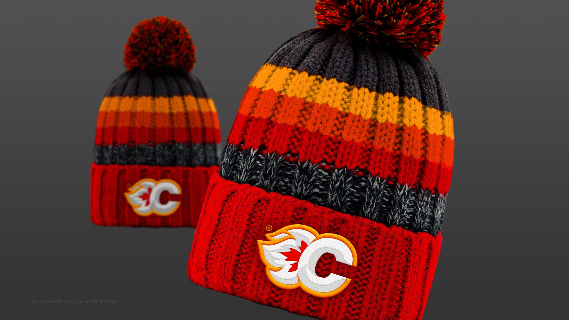
- Brand Update, Bespoke Typography, Apparel / Merchandise & UX


- Brief
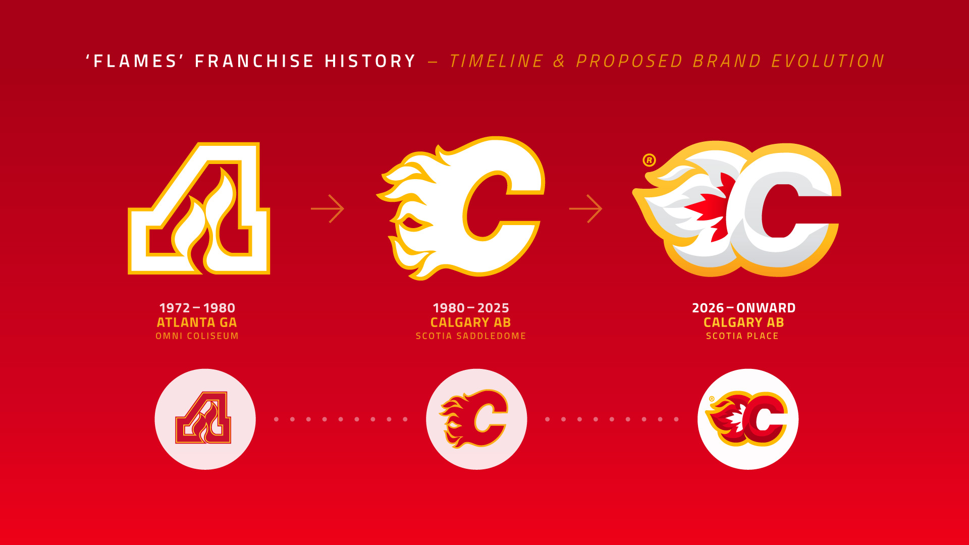
- The Flames™ (formed in Atlanta, Georgia in 1972) have been in Calgary for past 45 years. Yet their brand remains unchanged from the ‘Flaming C’ penned by Patricia Redditt in 1980.
- Requirements
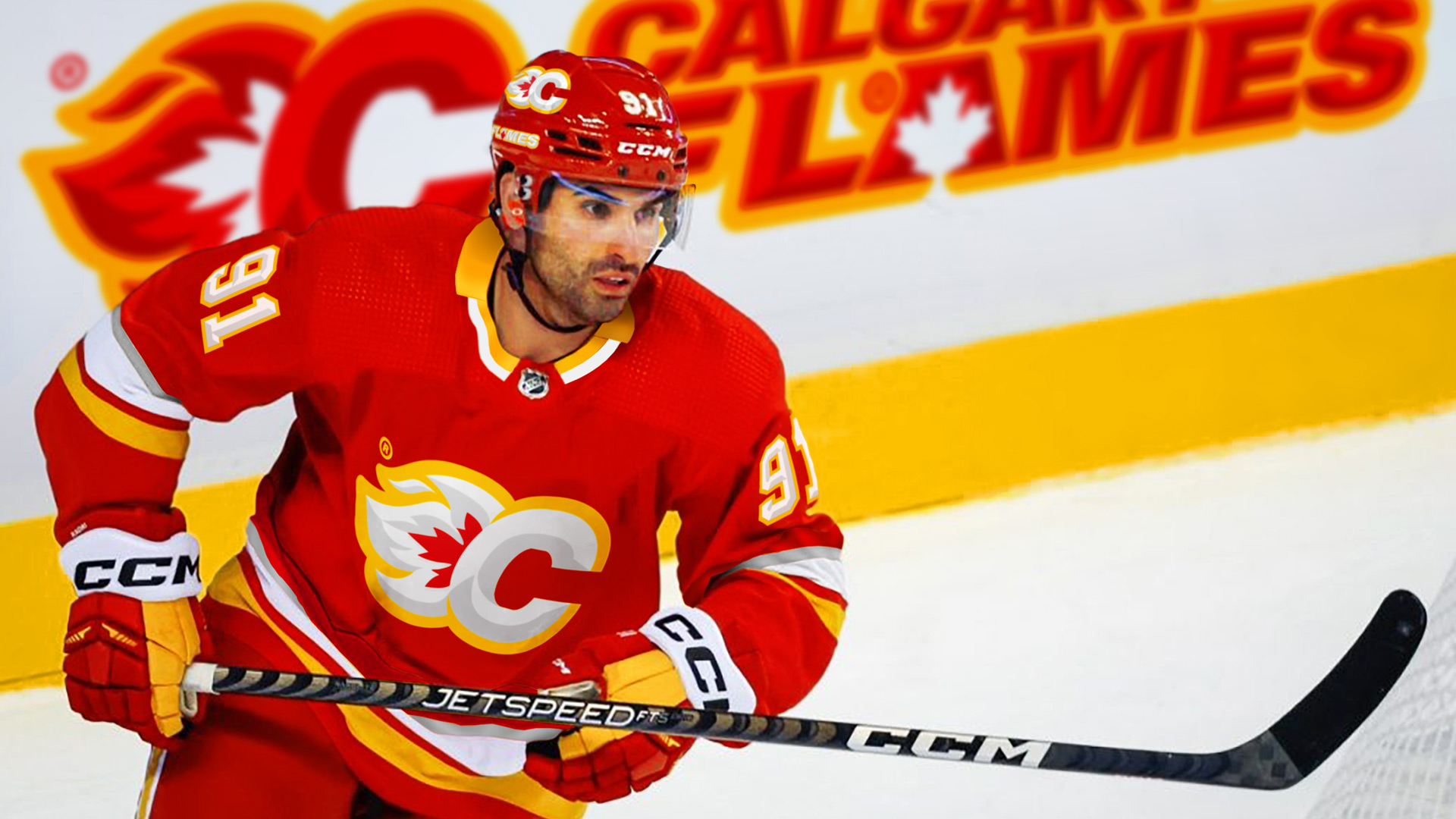
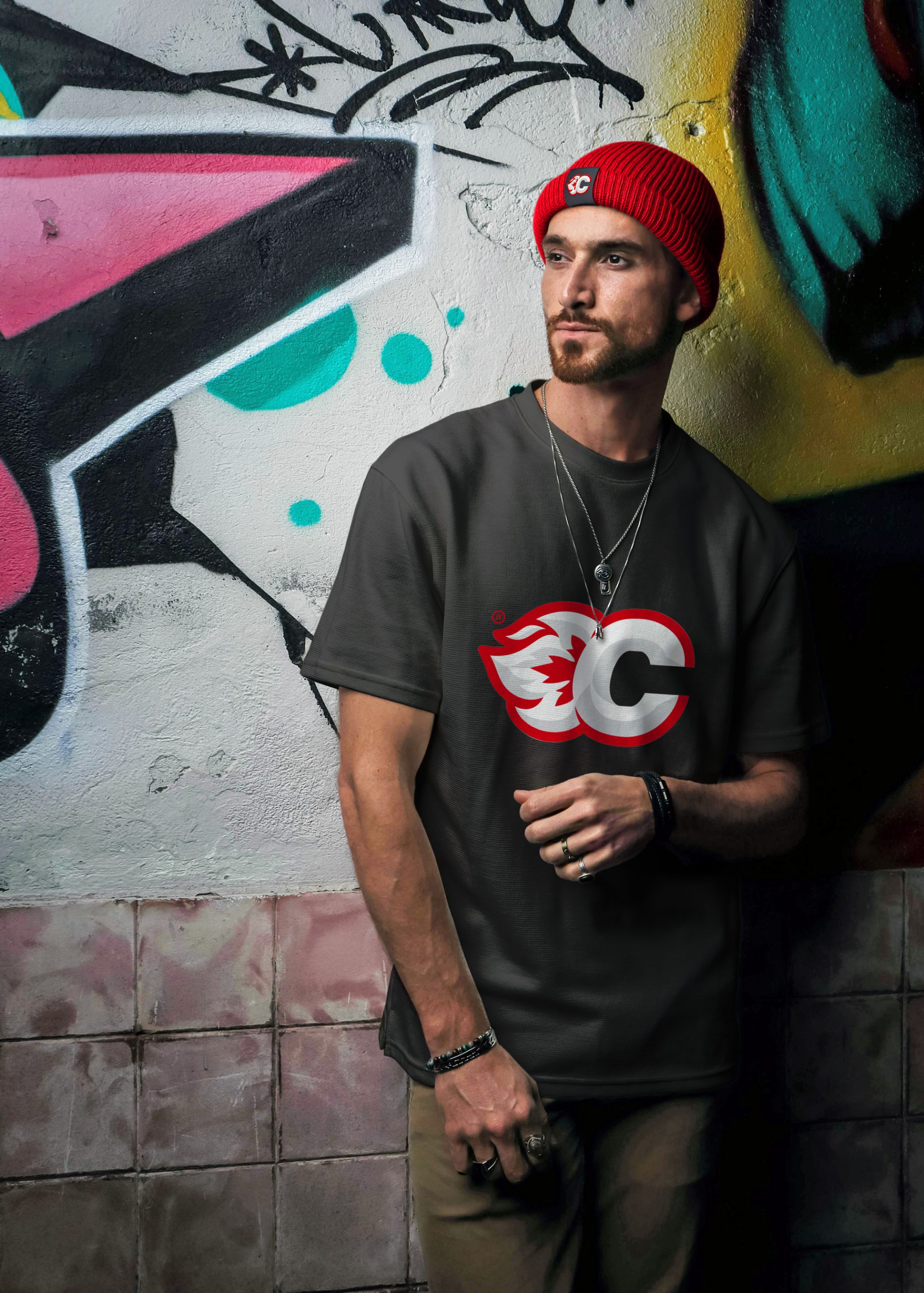
- Times have changed. The franchise is currently undergoing a period of rejuvenation / transformation, including the construction of a new purpose built (multi-use) arena in downtown Calgary and the future is looking brighter than ever for Flames fans. Any ‘refresh’ should include a nod to the team’s heritage (colours, existing logo, etc.), be graphic, boldly original and localised (Calgary/Canada), yet feel familiar; retaining the loyalty of the 'C of Red'.
- Solution
- Polls were conducted with 200+ (British & European) GenY & GenZ individuals and a number of issues were identified and confirmed. To the uninitiated... the current brand was confusing! The vast majority were unable to work-out what the logo might be for, nor which sector it might belong to! A little under half of those surveyed didn’t recognise any ‘flames’ at all. With a little over a quarter unable to decipher the ‘C’! Guesses ranged from a “roaring lions head” to "an octopus". Nine out of ten surveyed, said they would not consider buying or wearing merchandise with it on. Clearly there are challenges with regards to the legibility of the brand. These need to be addressed if an expanded / 'global market' for the Flames is to be developed.
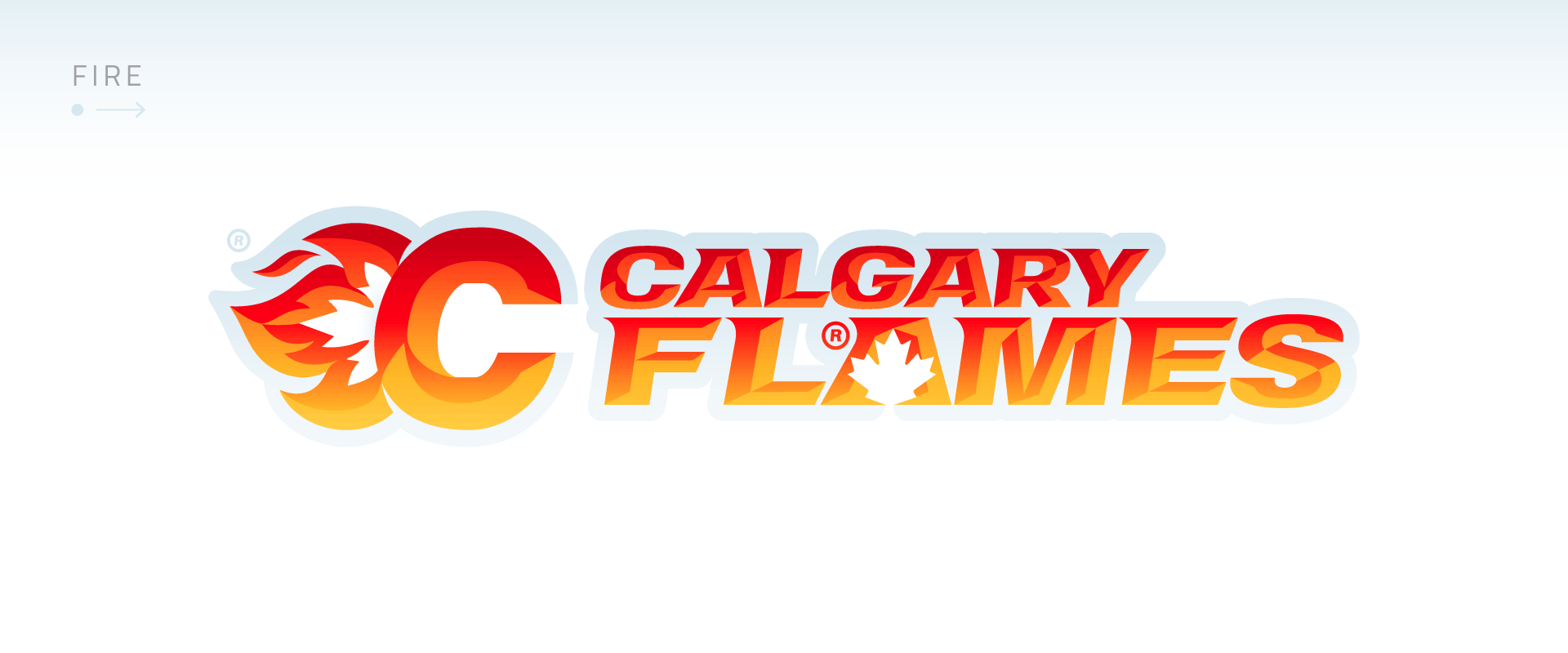
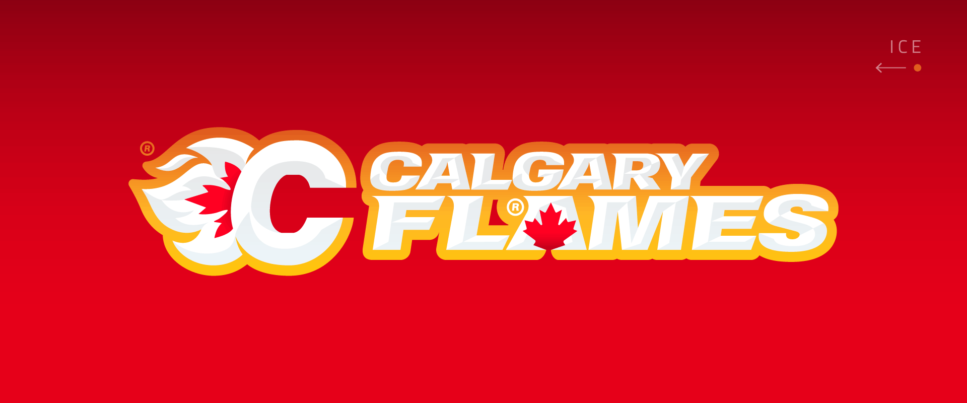
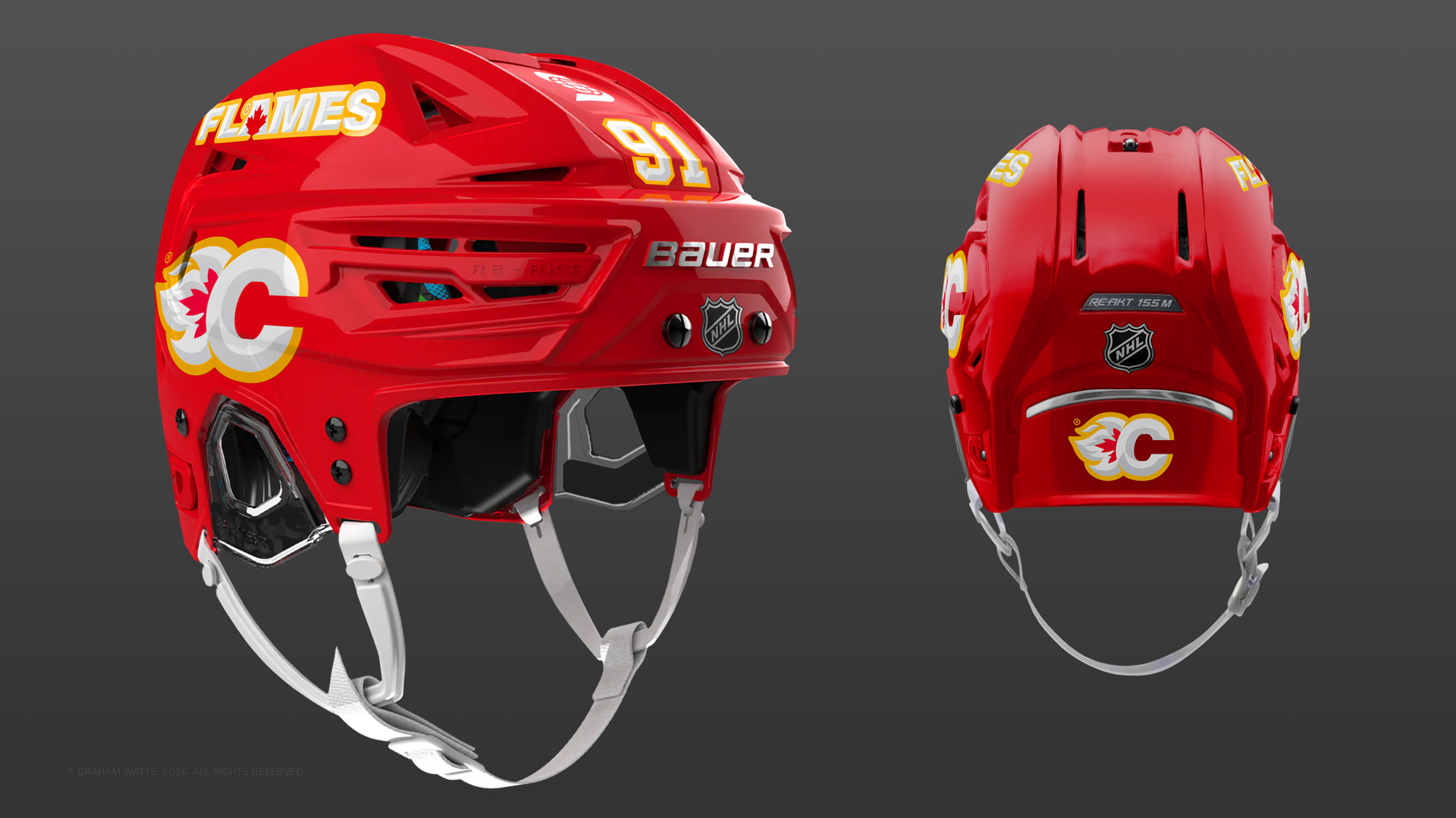
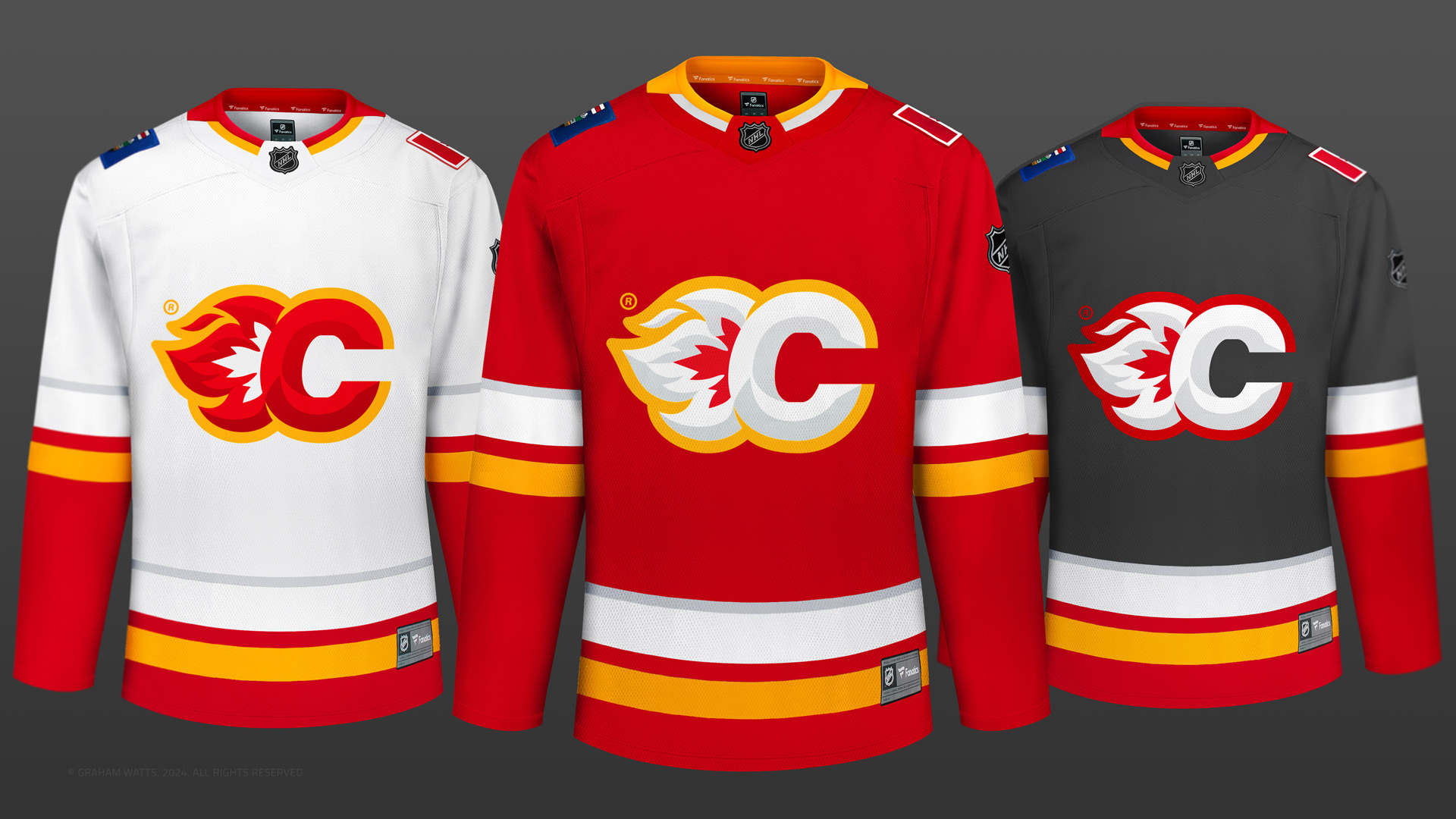
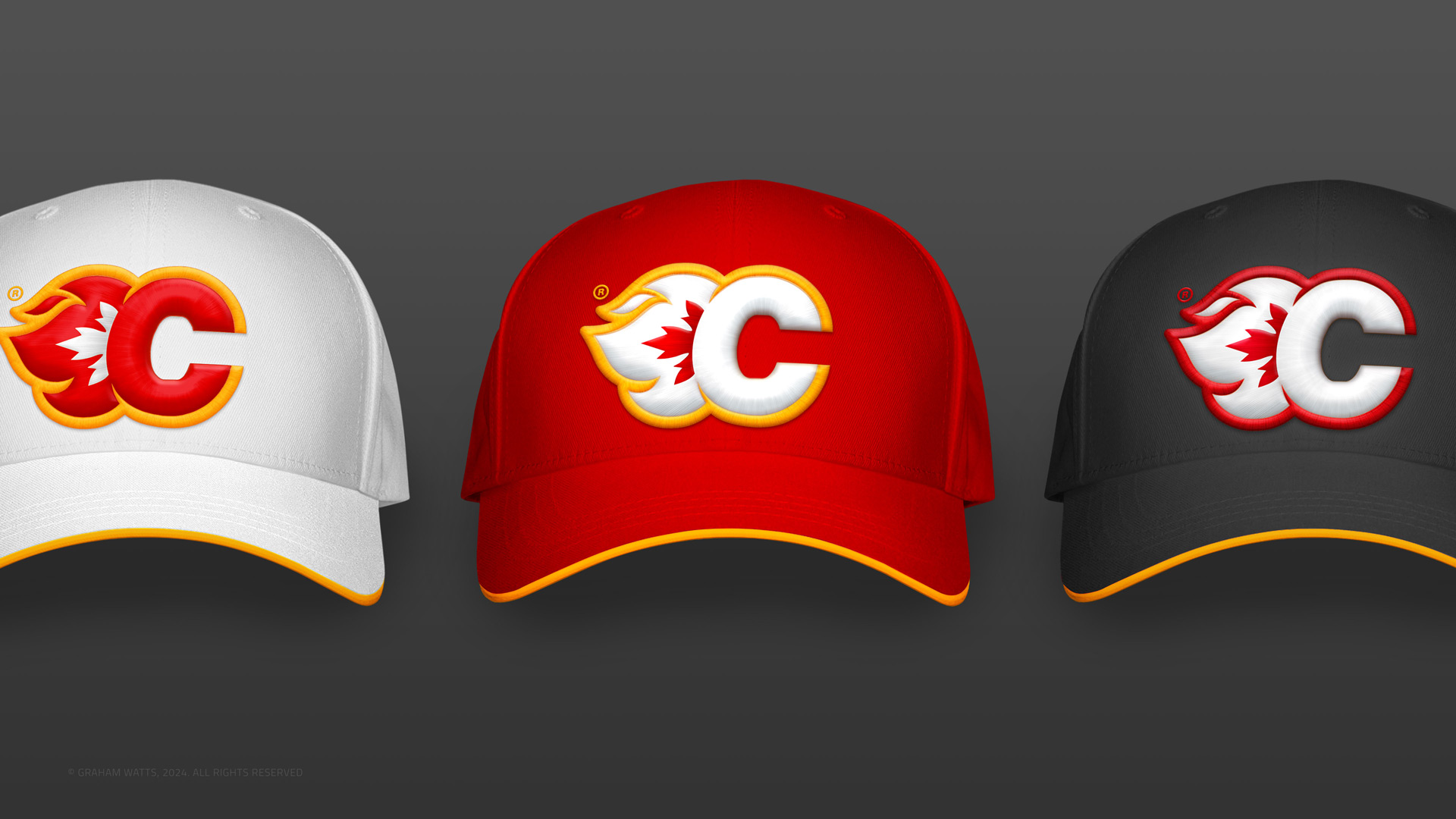
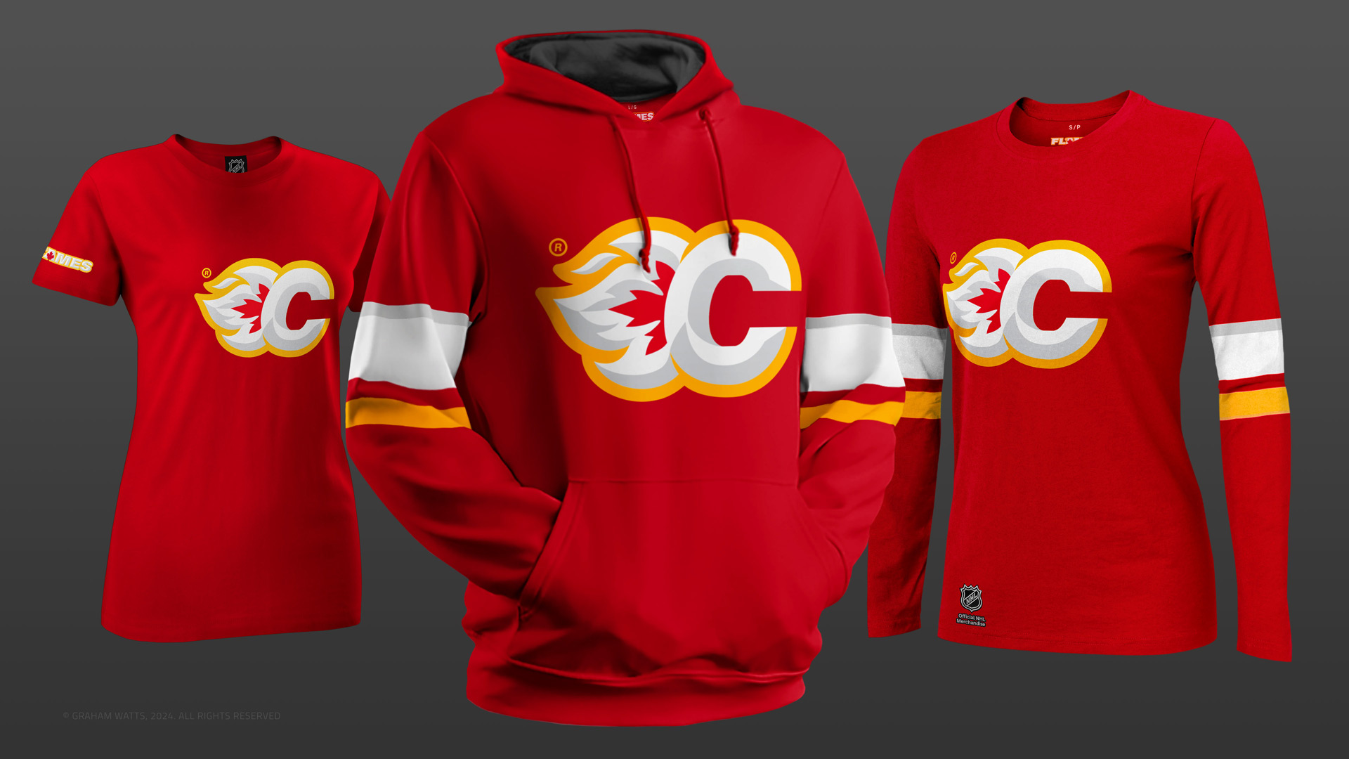
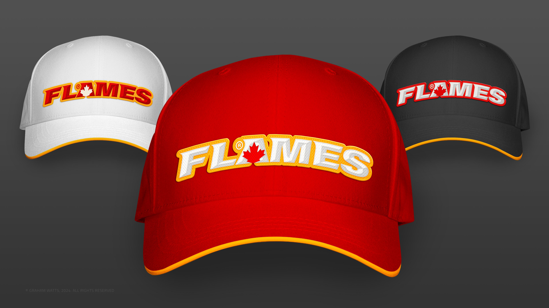
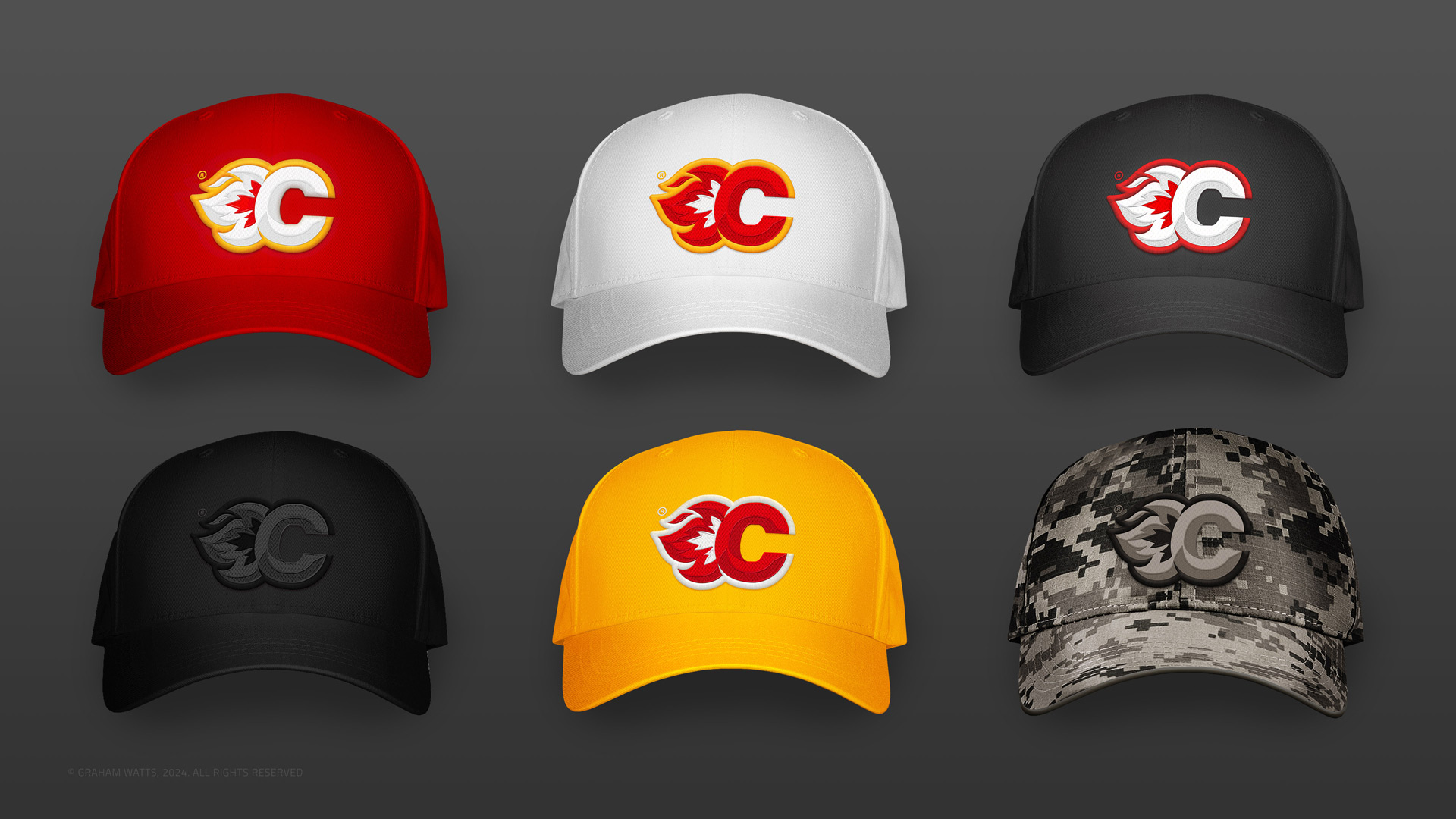
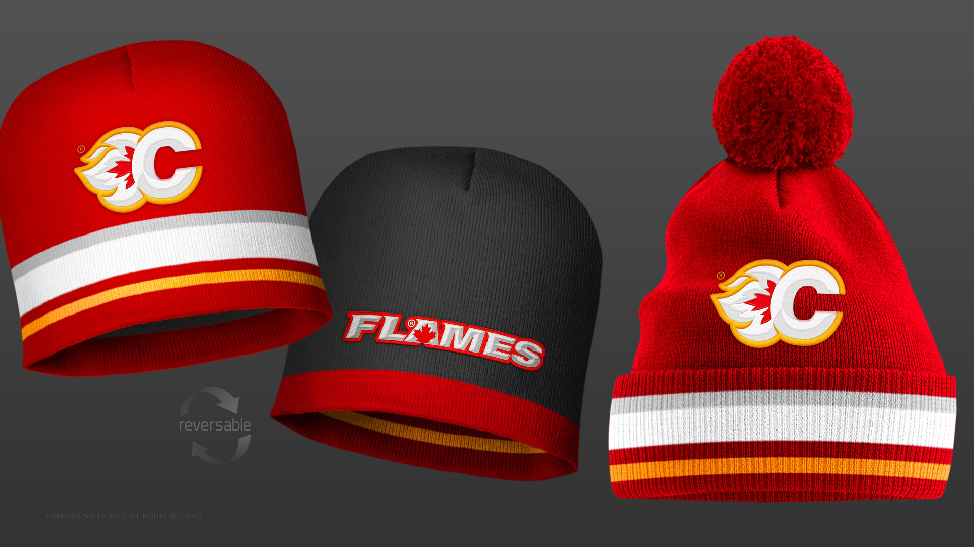
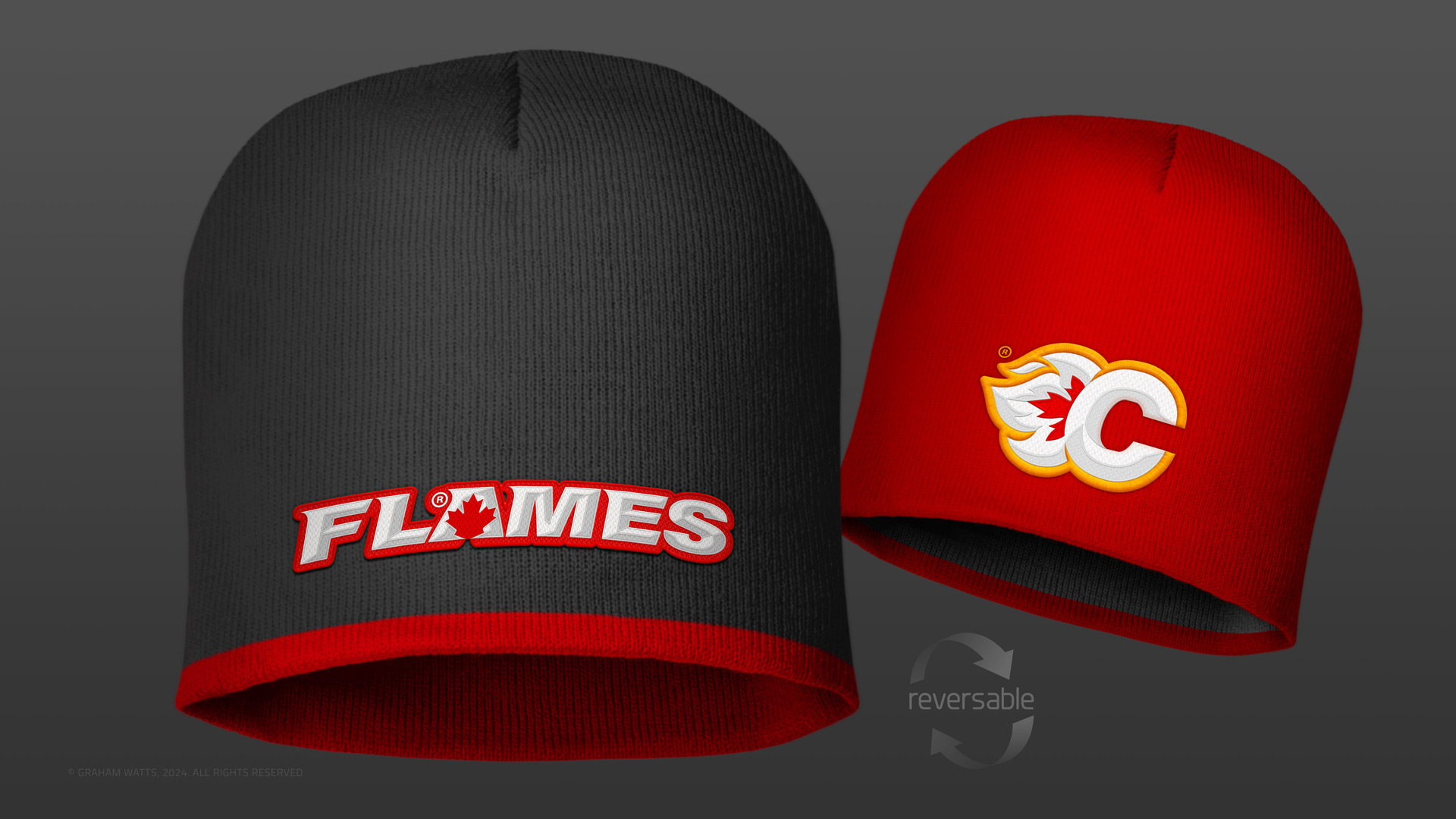
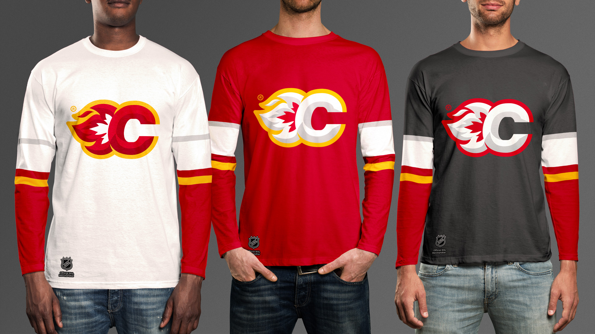
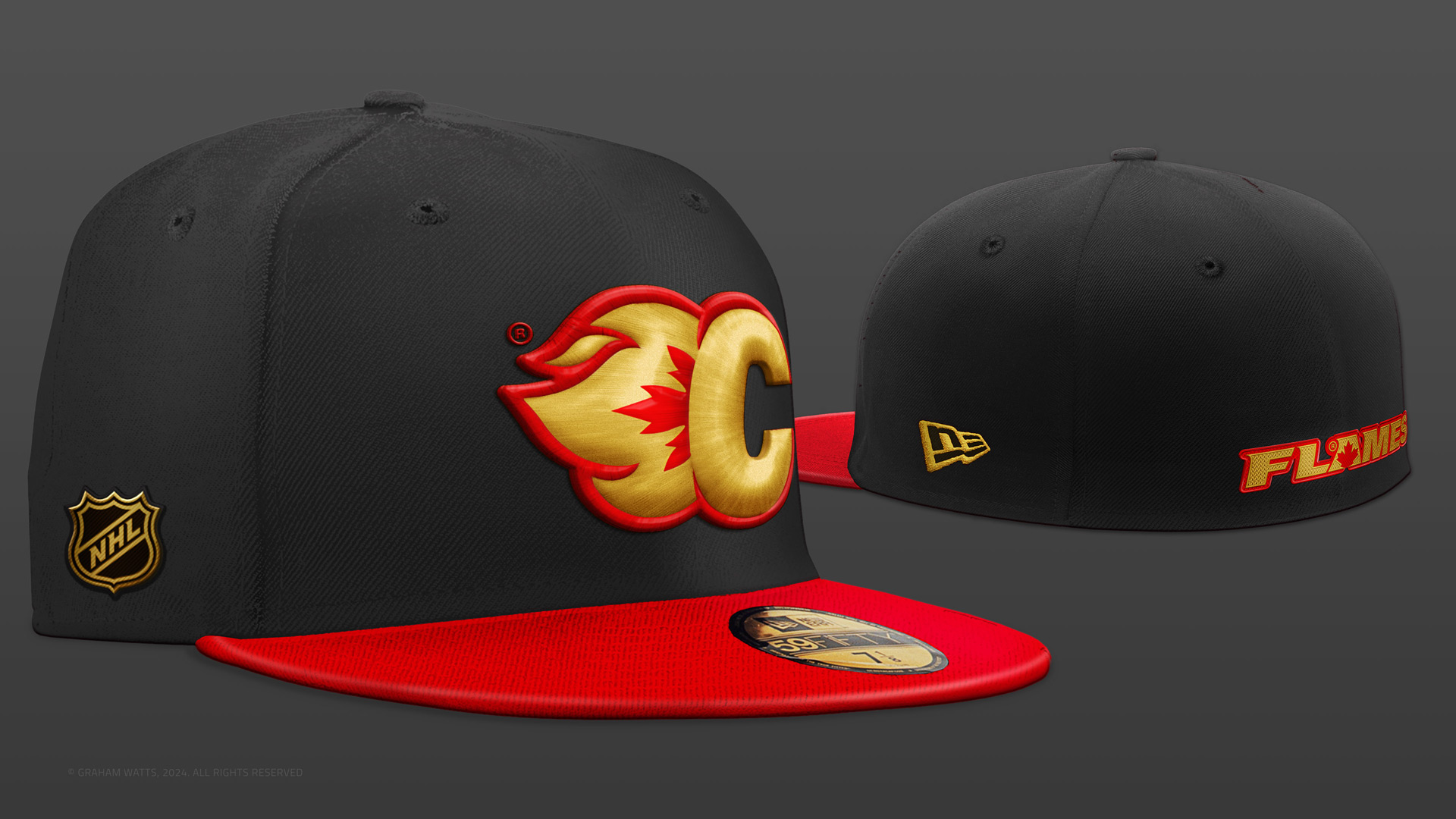
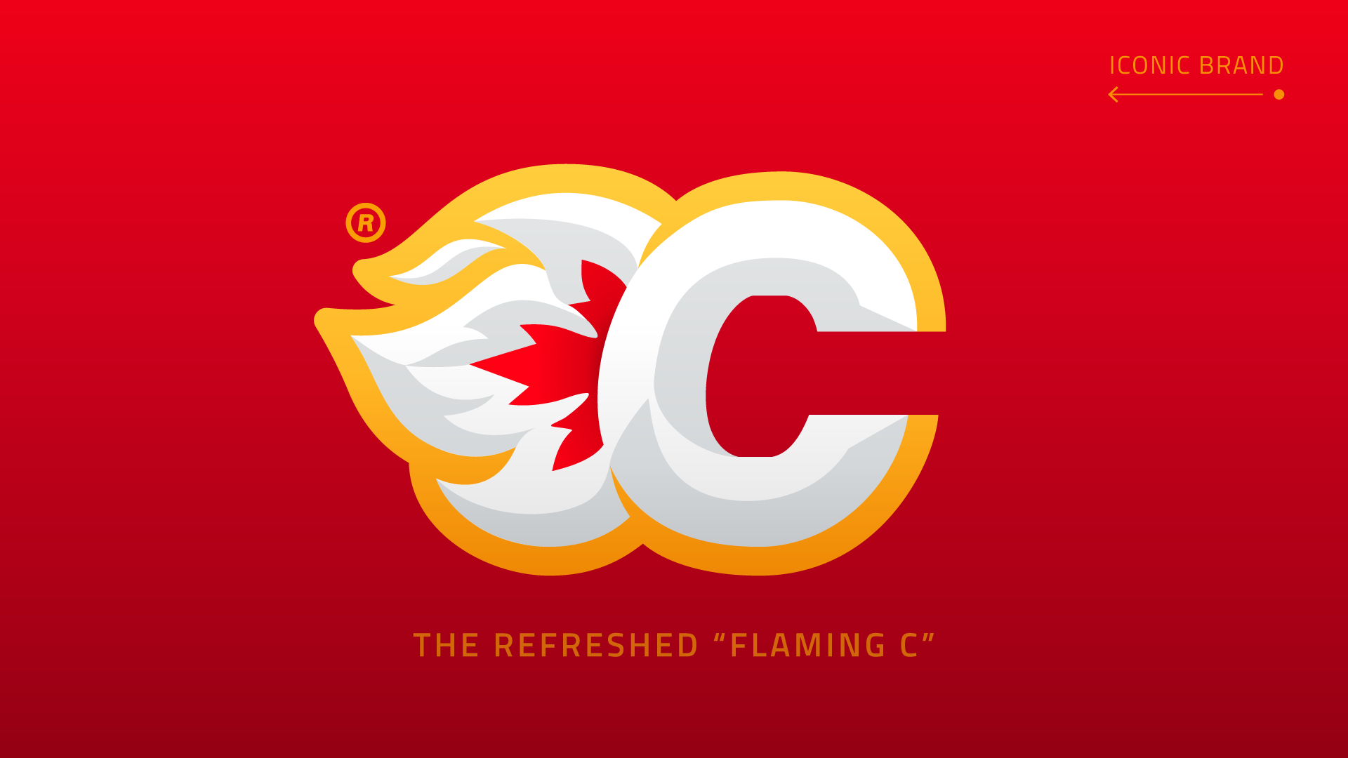
- Concepts were then voted on by survey participants, with the resulting design being cleaner, more scannable and quintessentially Canadian.
Keynotes:
- Refined flame forms (improved stylisation & cognition)
- Retained colour associations (historic & essential)
- Enhanced brand legibility (scans as a ‘Flaming C’)
- Added 'flag' & ‘puck’ allusion (via negative space)
- Improved visual consistency (across ‘colourways’)