'Upscaling' a trade brand
M&H Steel are an established British fabrication firm.
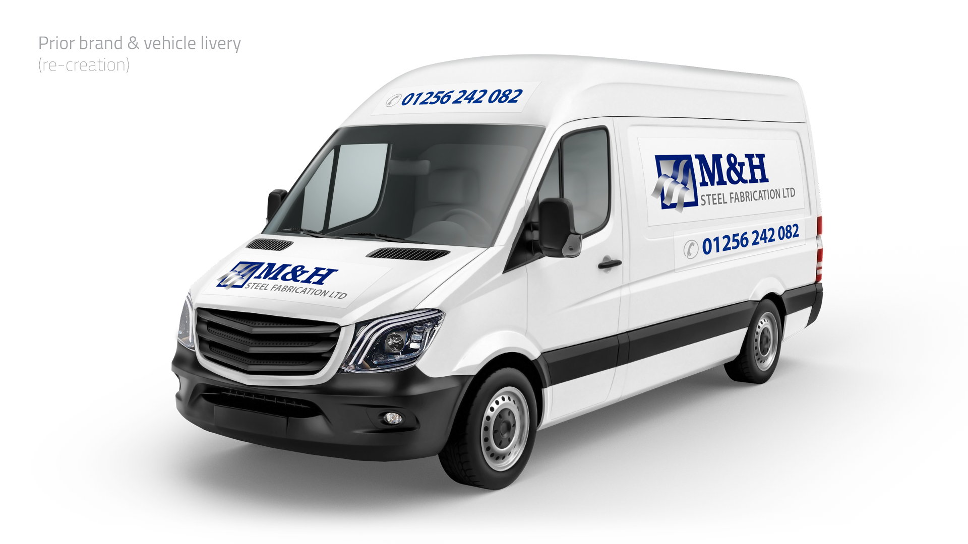
Currently experiencing a period of intense growth including a dramatic increase in large-scale / corporate-sector commissions; their original (‘ad-hoc’) logo projected a less than stellar image in stark contrast to their competitors.
- Client
- M&H Steel Fabrication Ltd
- Sector
- Construction / Steel Fabrication
- Services
- Strategic Brand Re-alignment, Visual Identity, Vehicle / Plant Livery, Website (UX)
- Brief
- M&H provide a complete steel solution; from CAD to fabrication and site erection services. Fully certified, they work on small to multi-million pound projects throughout the UK.
- Requirements
- Whilst M&H’s market-share and reputation has grown significantly over the past decade their brand has not. A new identity is long overdue; one that better reflects their corporate clientele and credentials (as experts in steel fabrication).
- Solution
- Initial discussions explored various approaches; an ‘update’ to the previous logo, the option to create a novel corporate-facing ‘sister-brand’ to accompany the existing business (perceived as a “local firm”) and a fresh ‘concept-driven’ (metaphorical) approach.
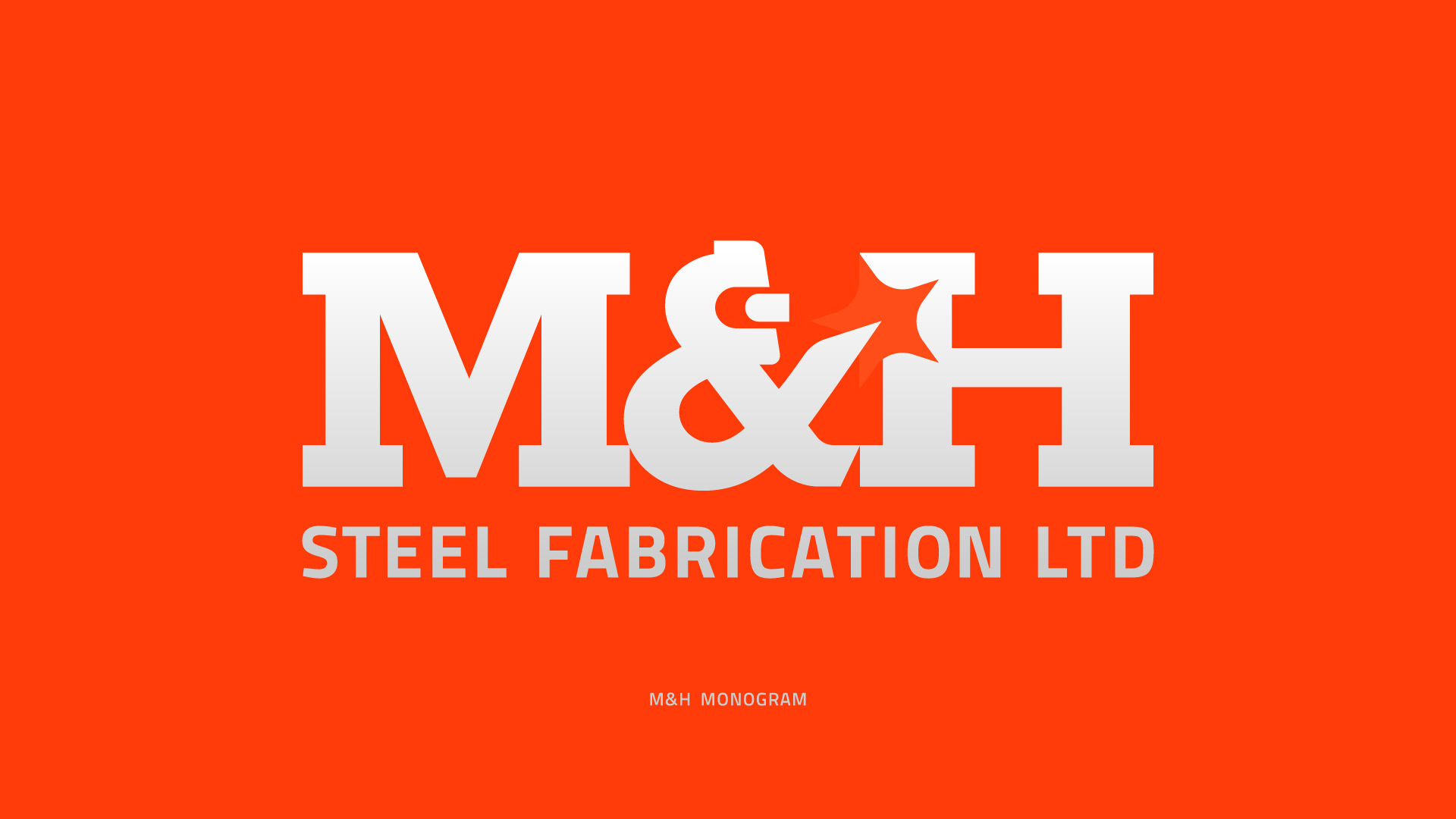
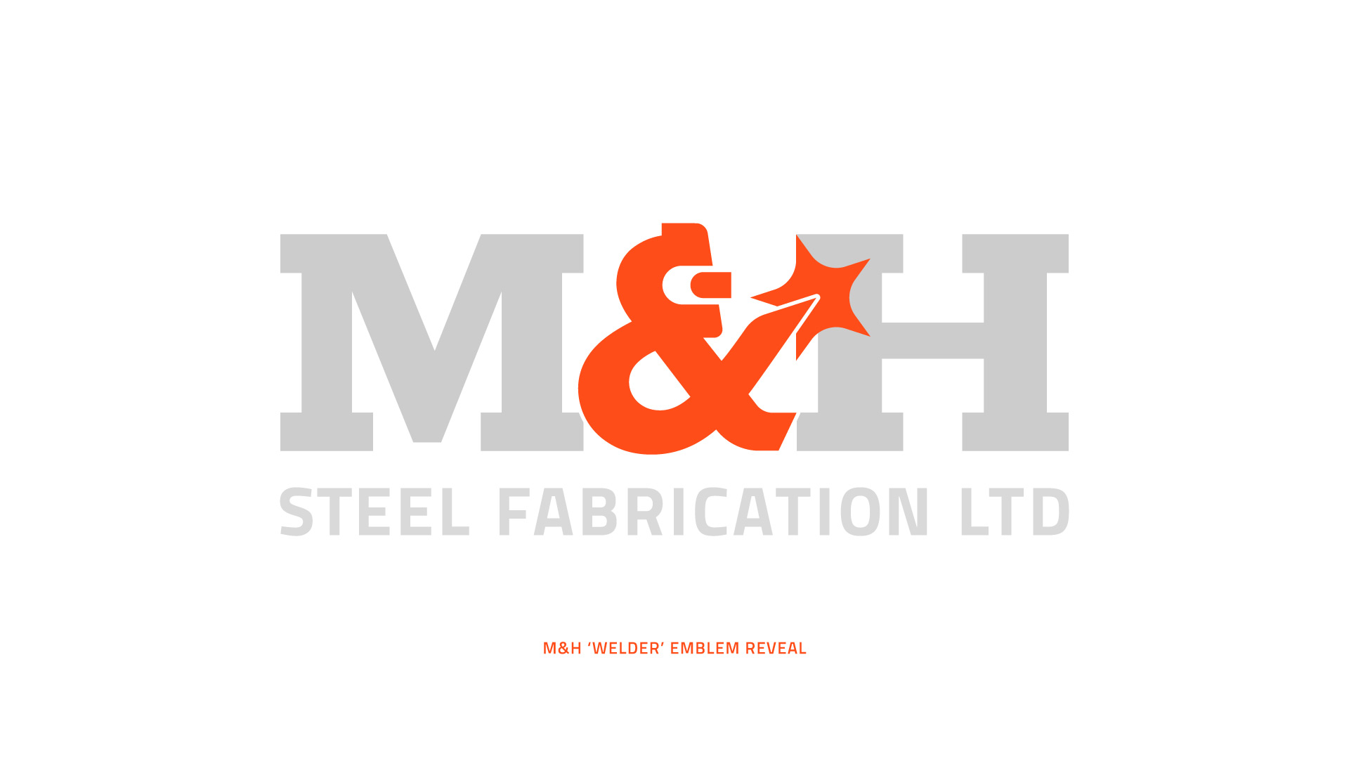
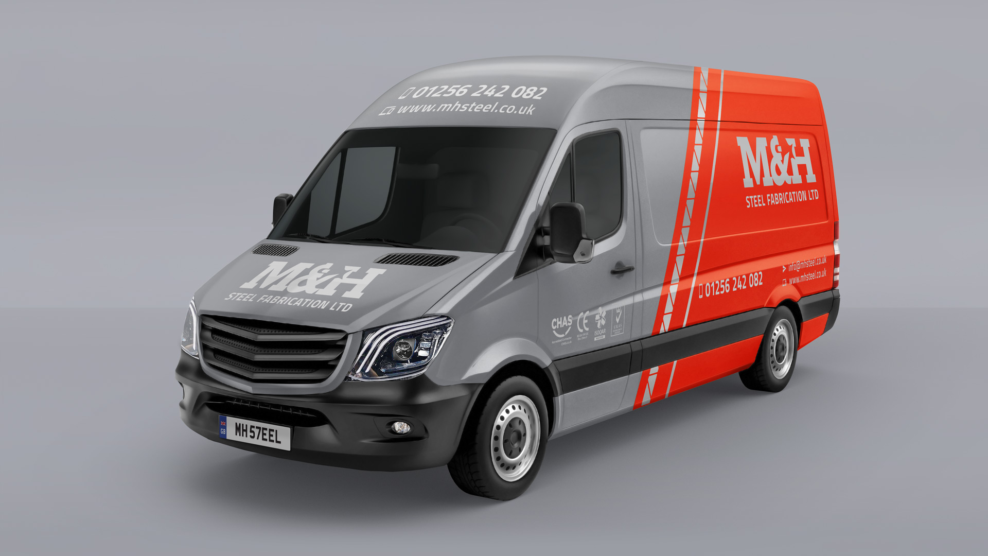
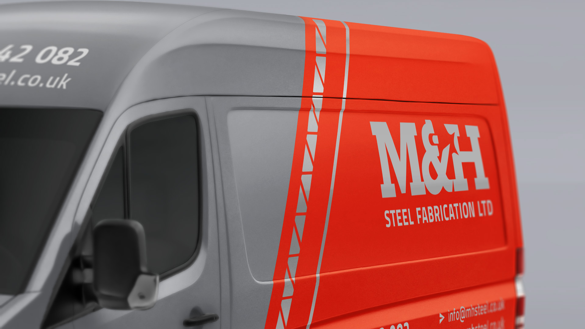
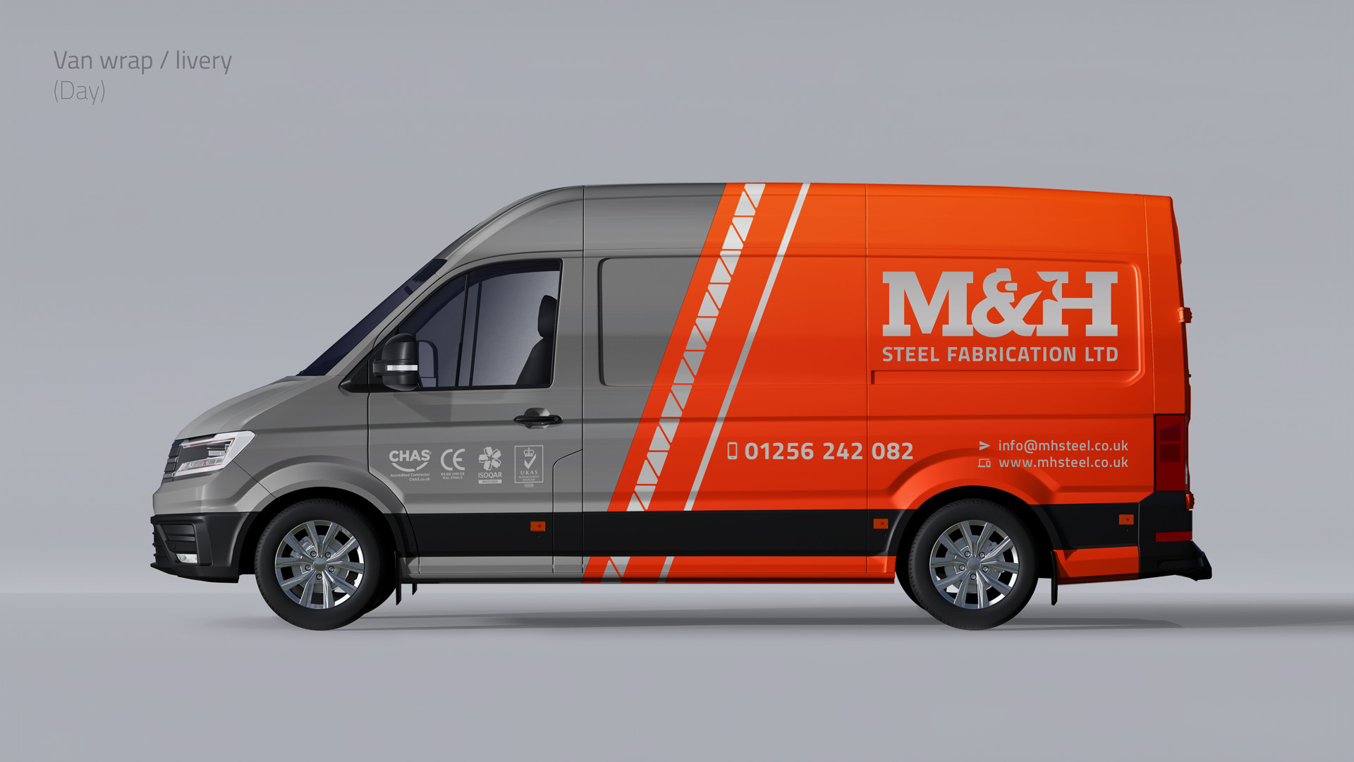
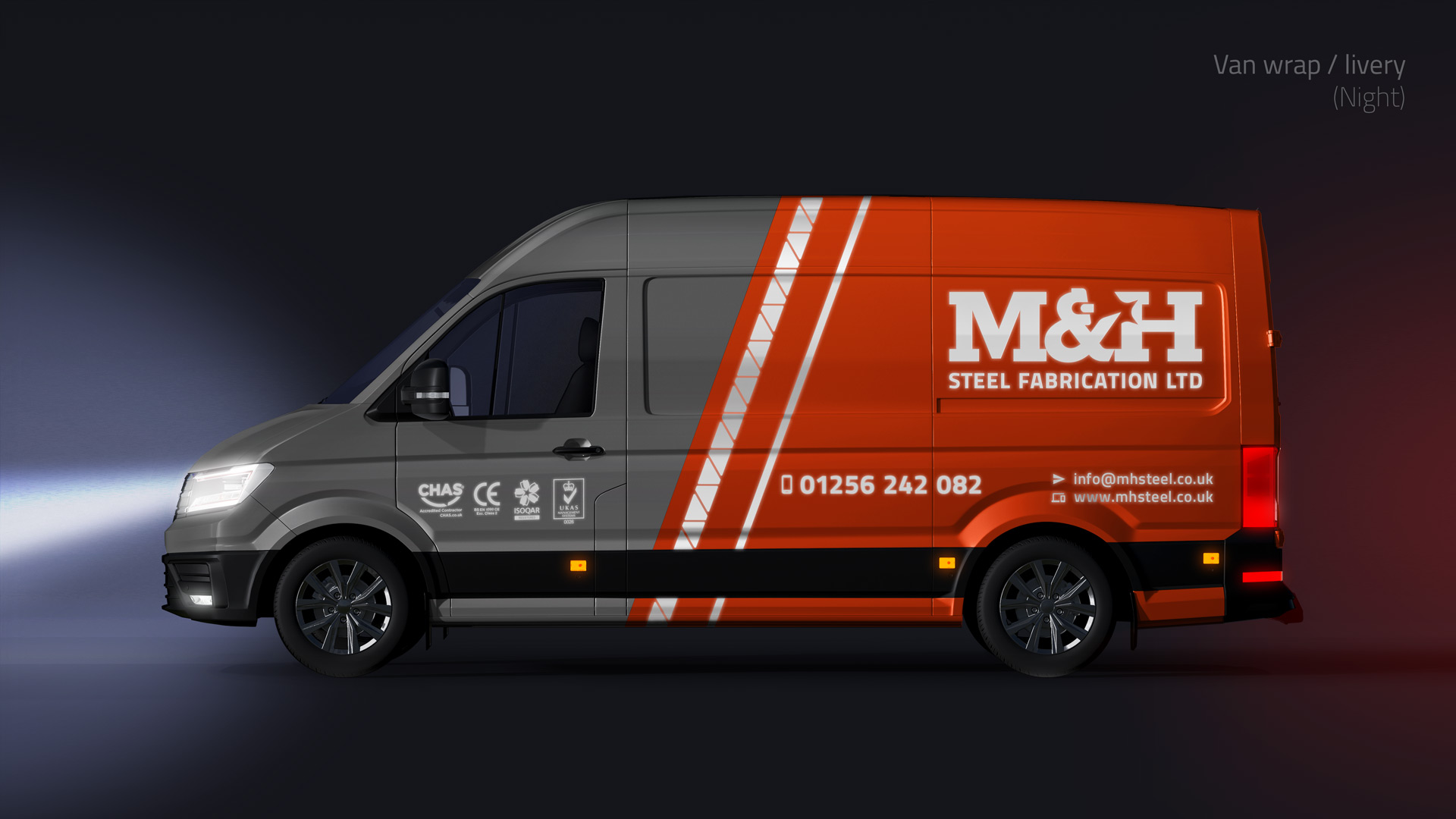
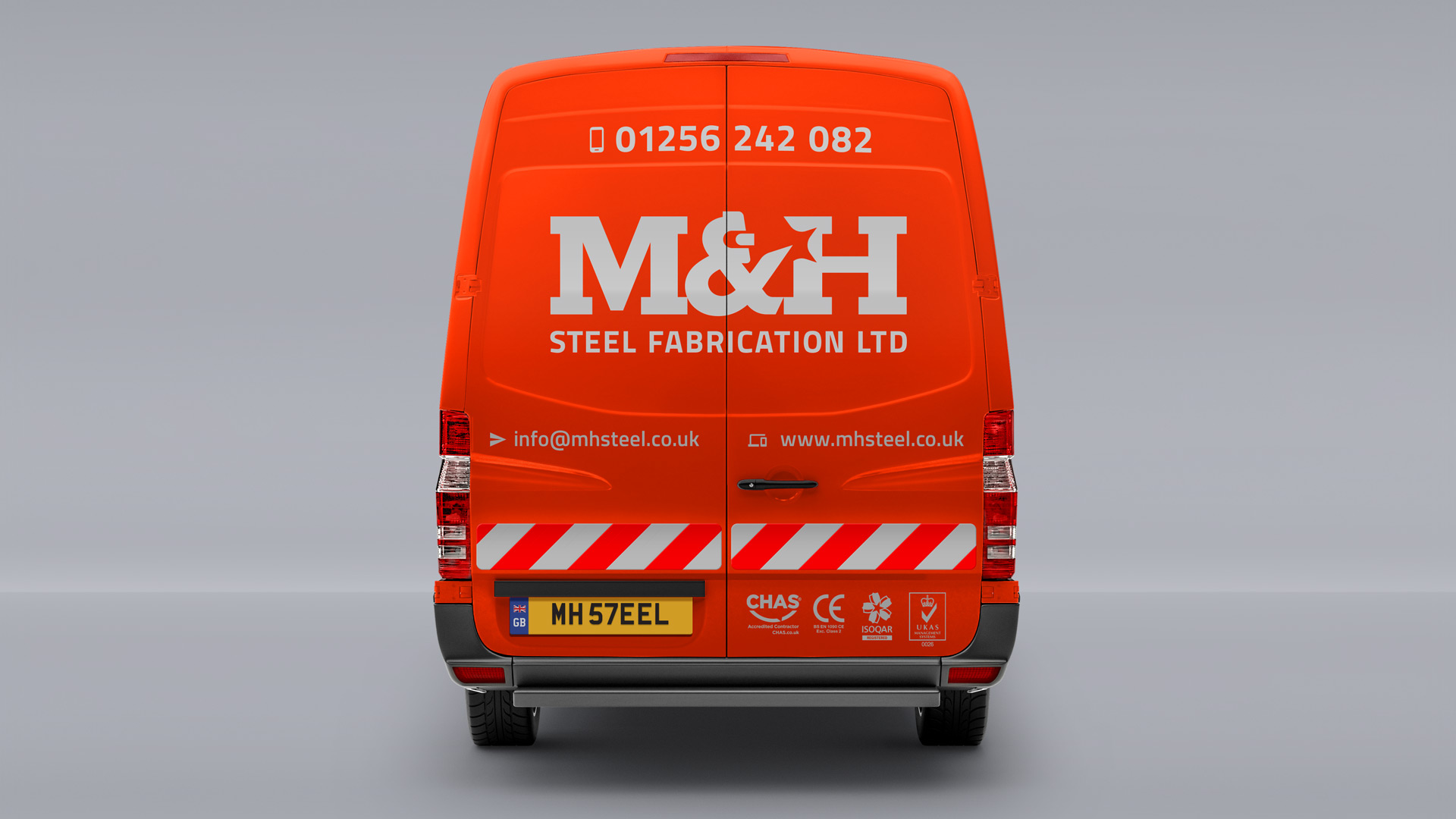
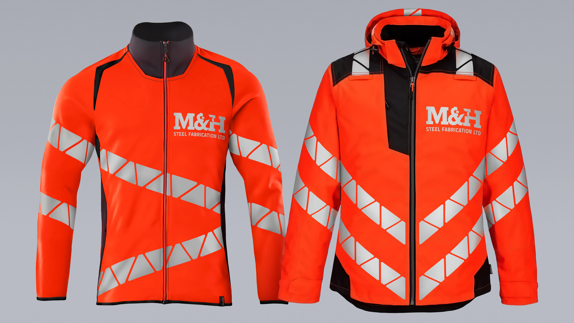
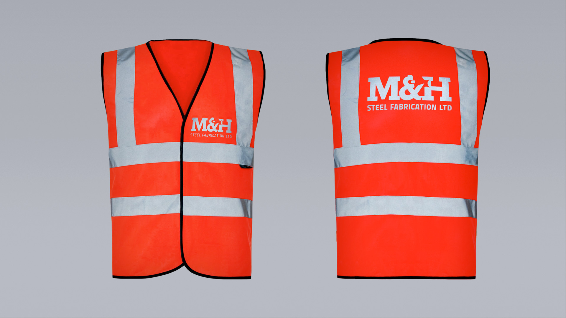
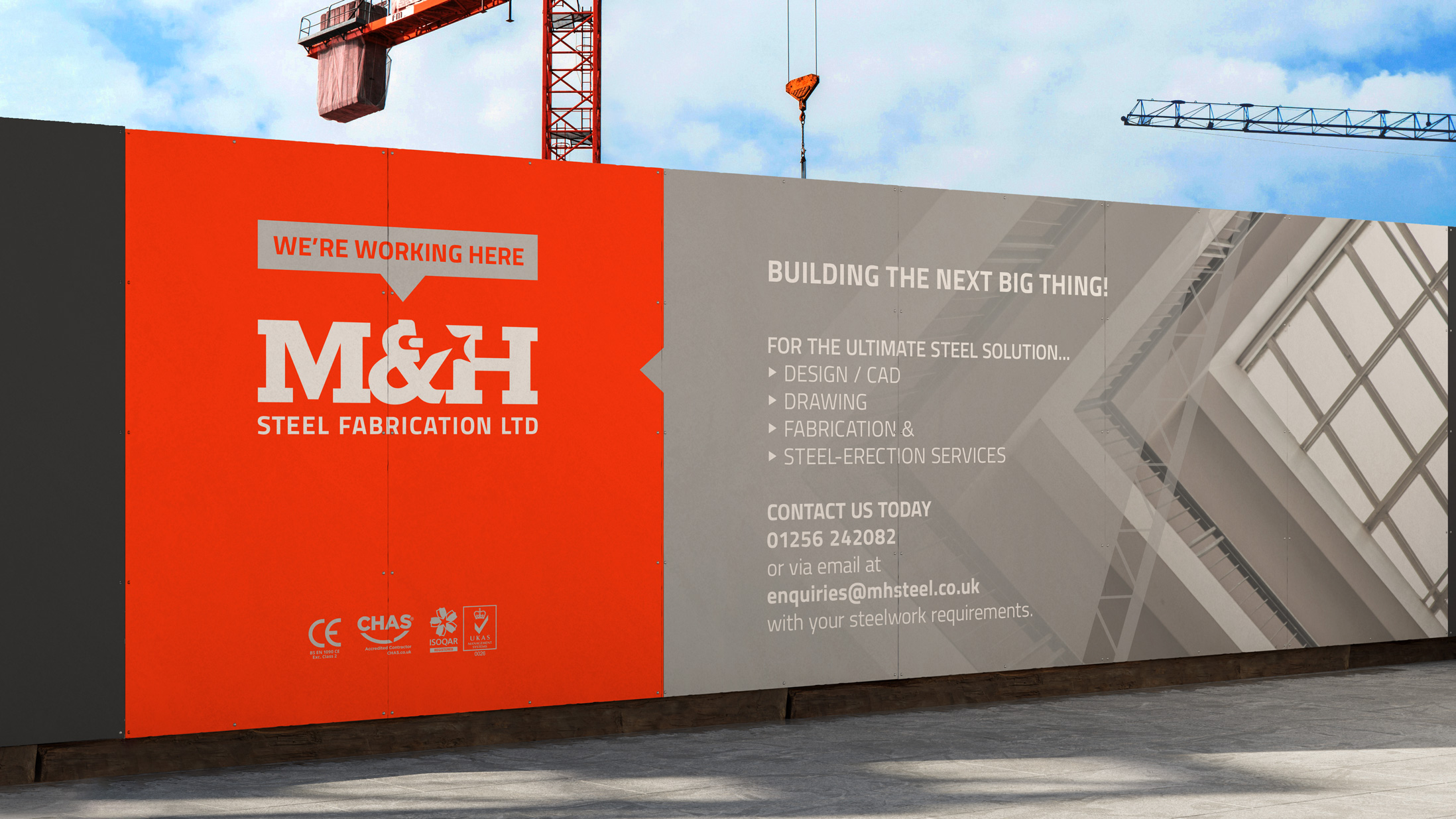
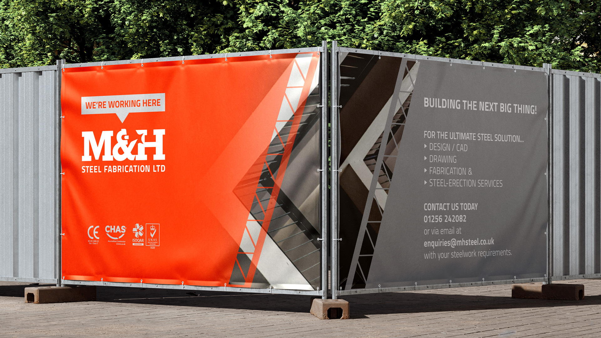
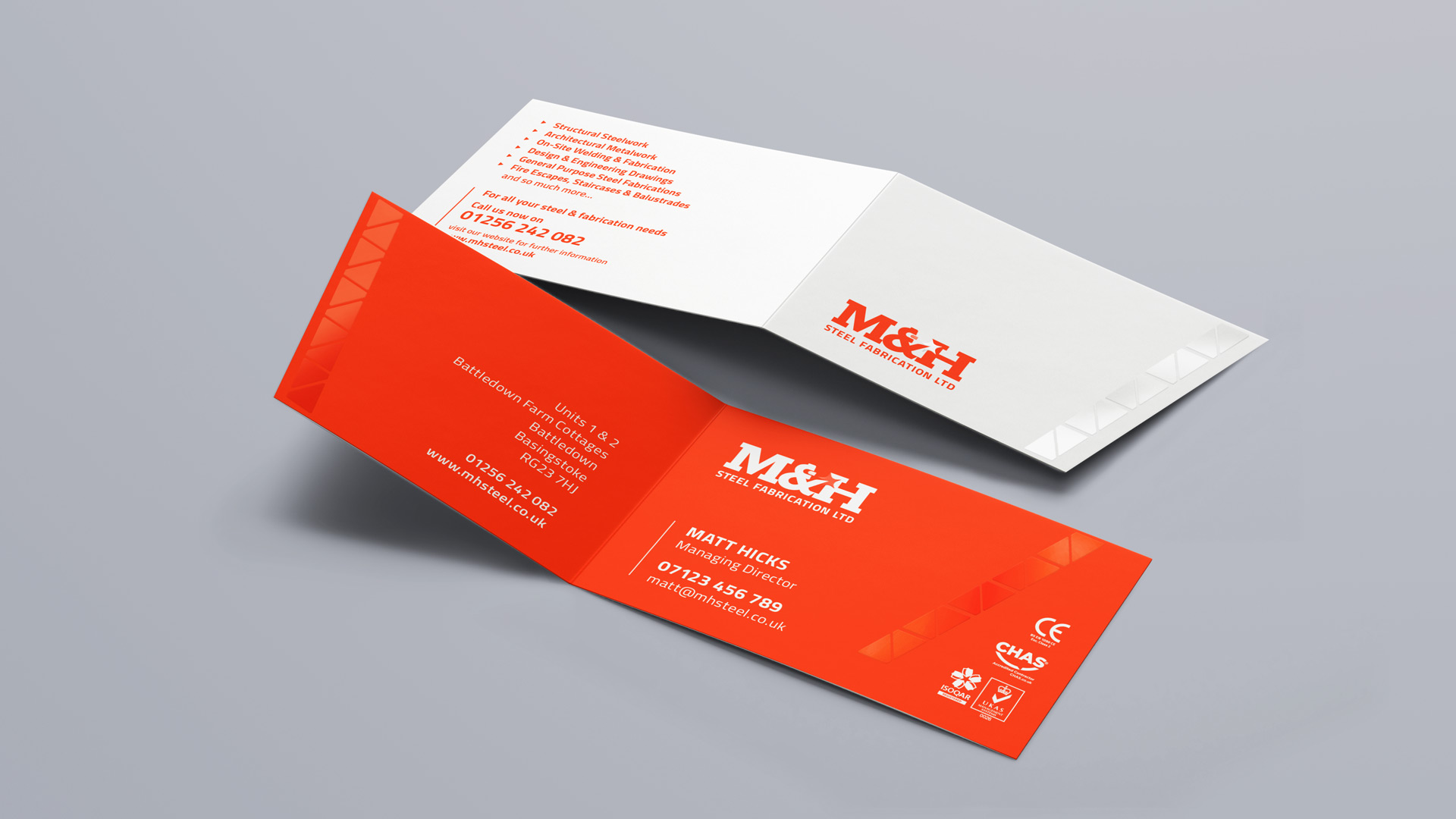
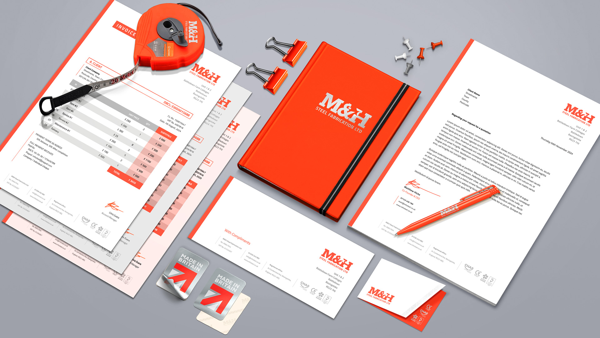
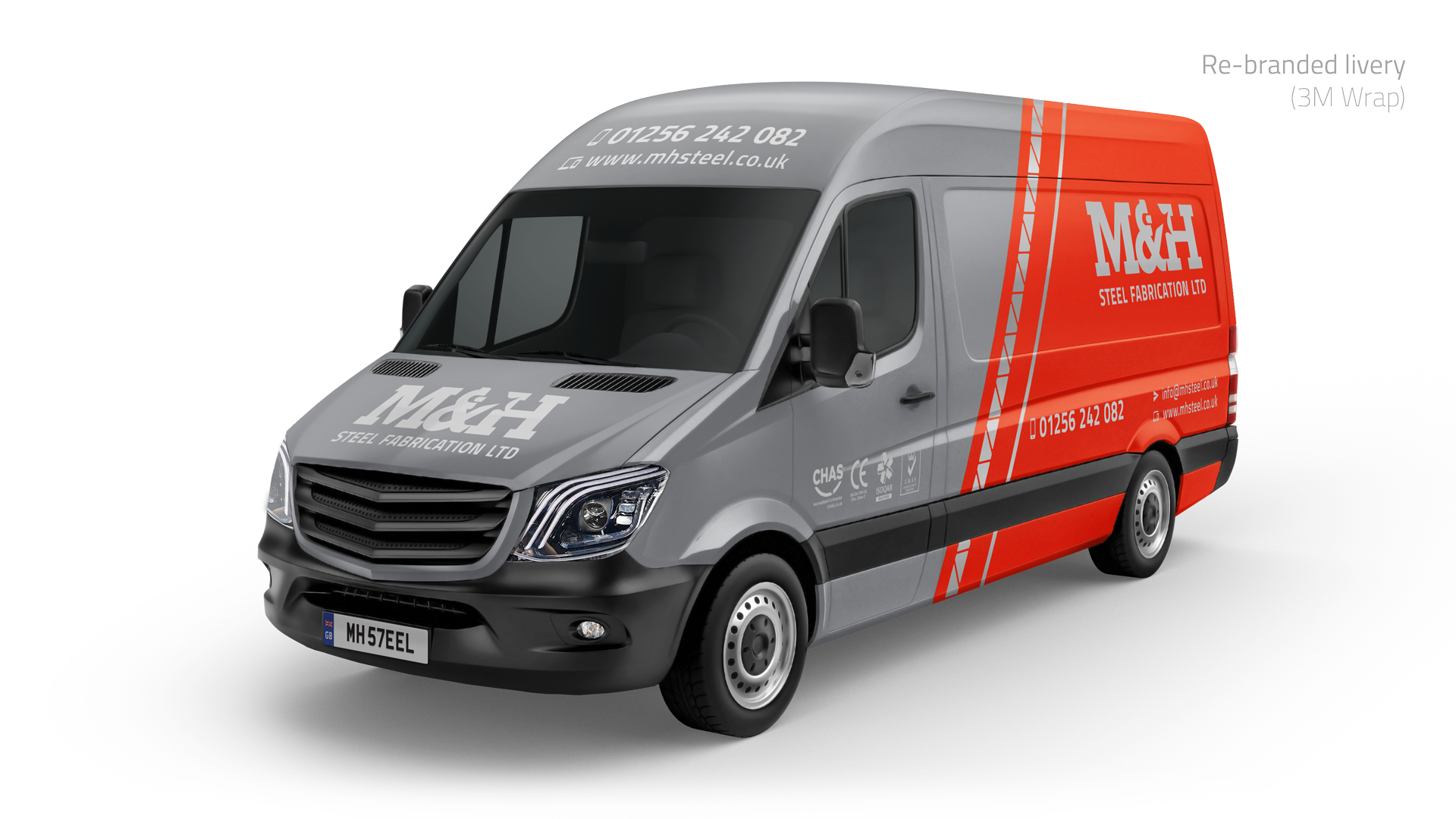
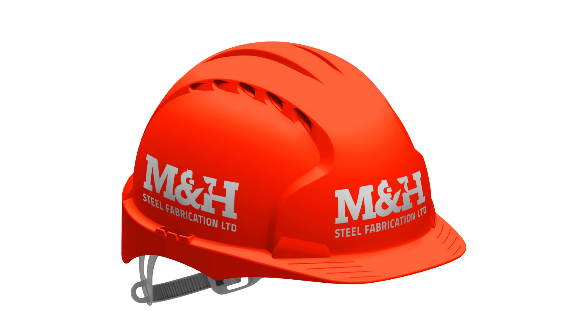
- The new design marks a departure from the ‘white van’ (unprofessional) connotation. A vivid brand incorporating a ‘welding’ motif—representing skill and ingenuity—and a ‘hi-vis’ site aesthetic (an explicit reference to professional practice / standards in large-scale construction).
Keynotes:
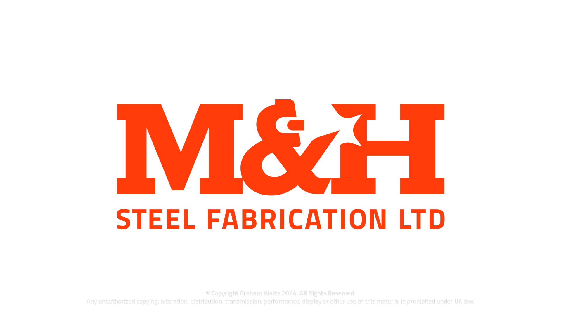
- Integrated ‘welding’ motif (iconic trade metaphor)
- Singular ‘Hi-Vis’ style (promotes professional perception)
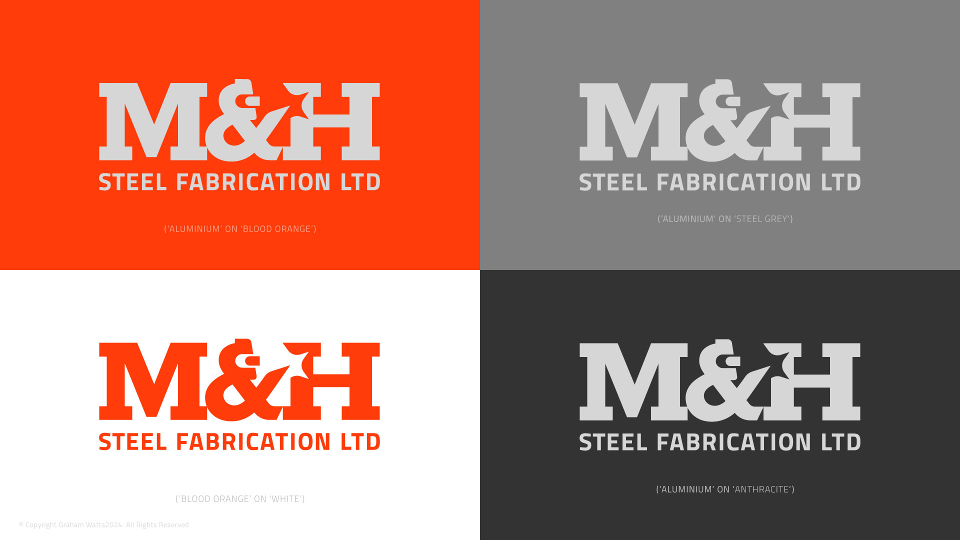
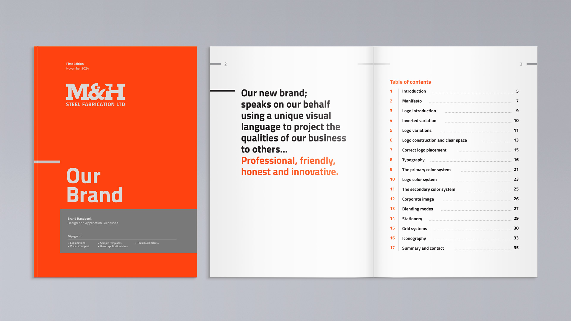
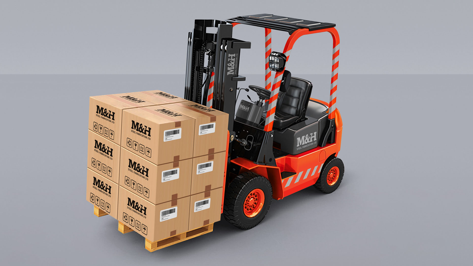
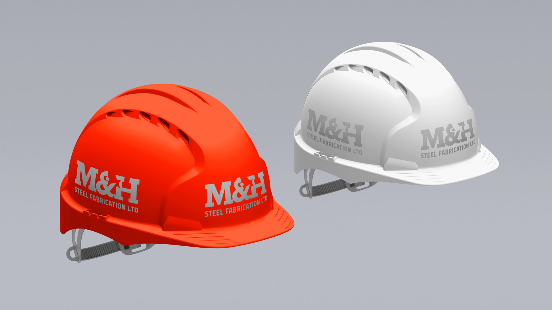
- Unified experience (fleet livery, apparel, print & digital)
- Improved legibility & cohesion (builds brand cognition)
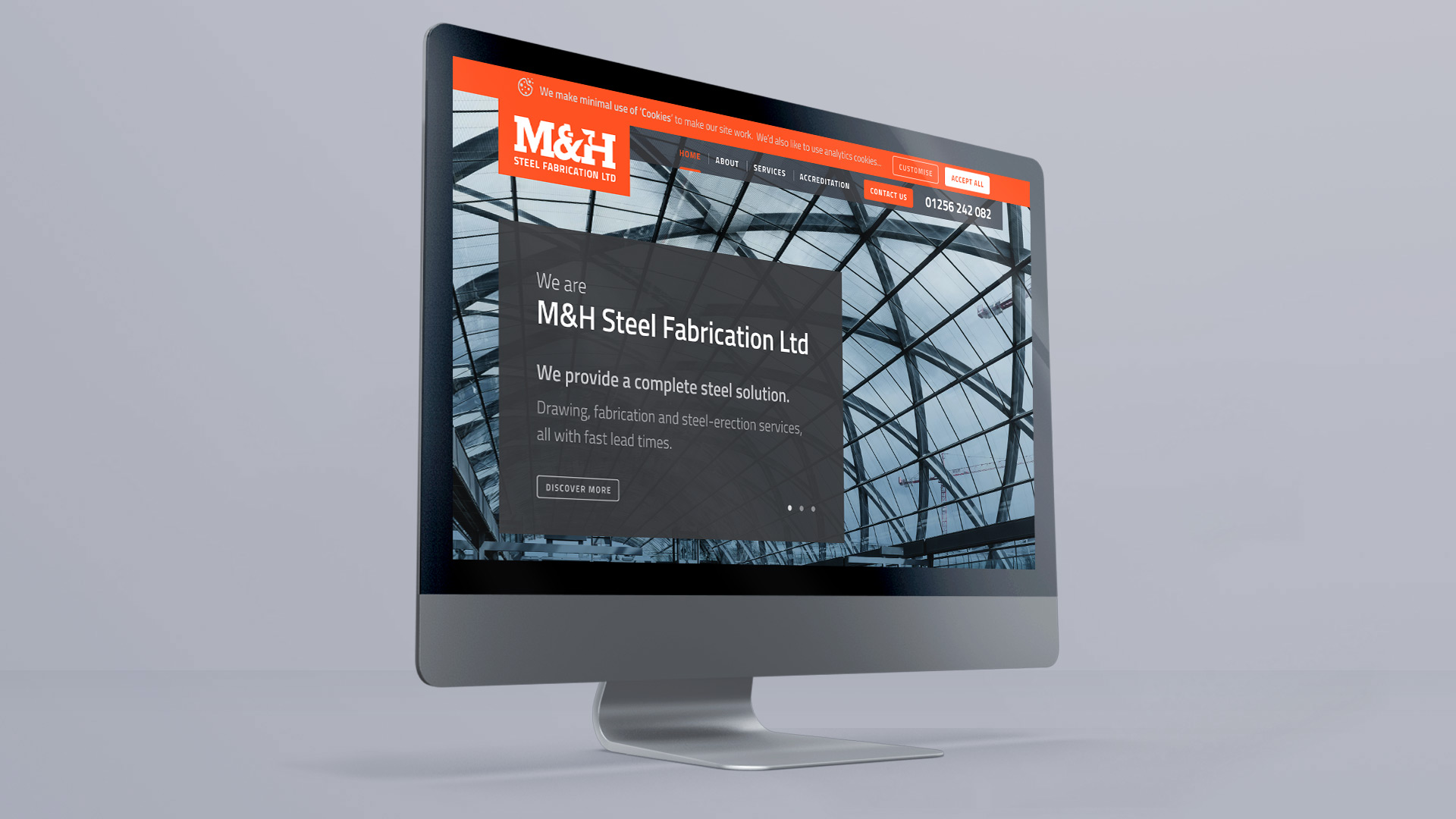
- Improved website UX (visual hierarchy and animation)