Re-aligning a tech brand
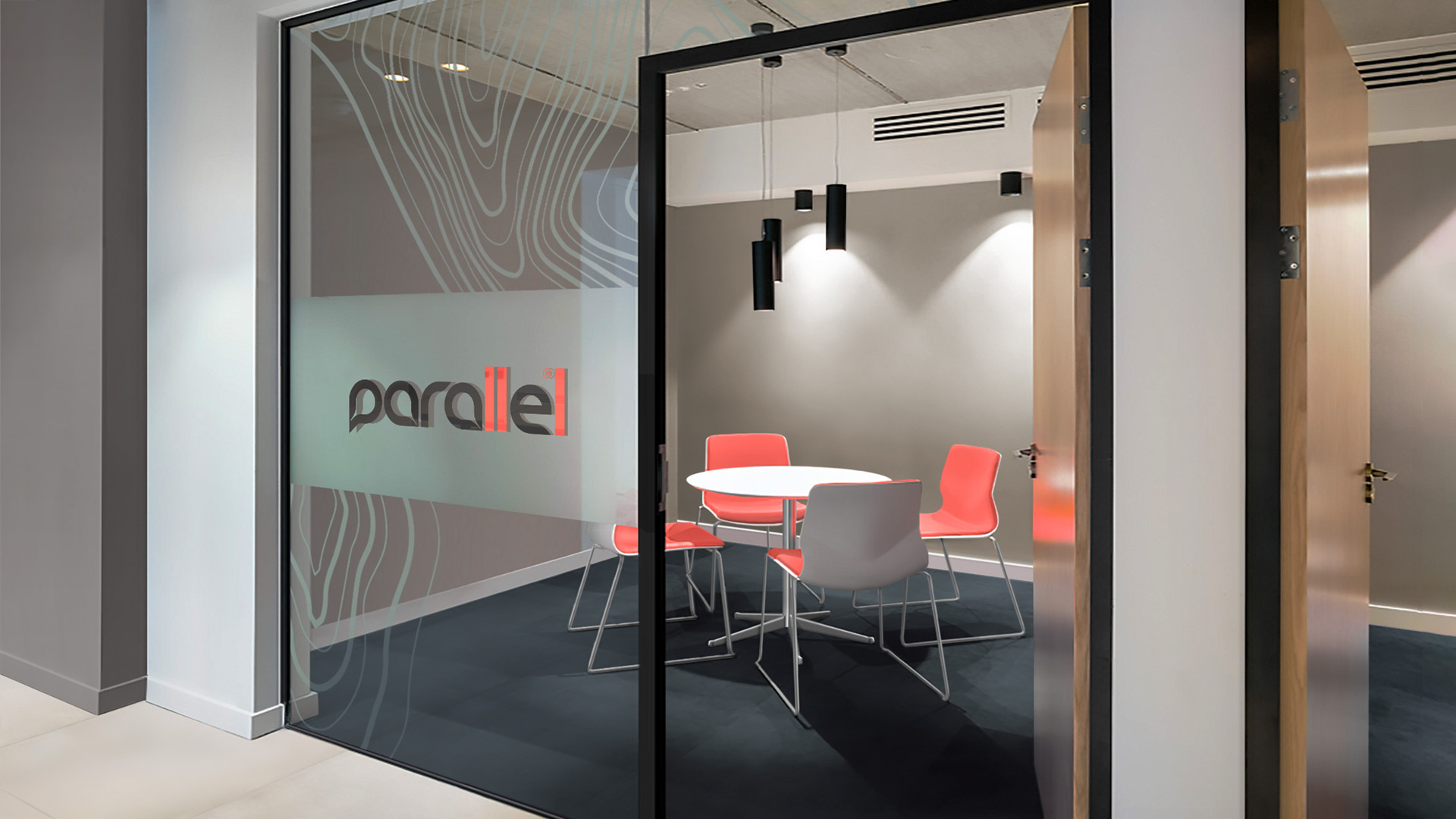
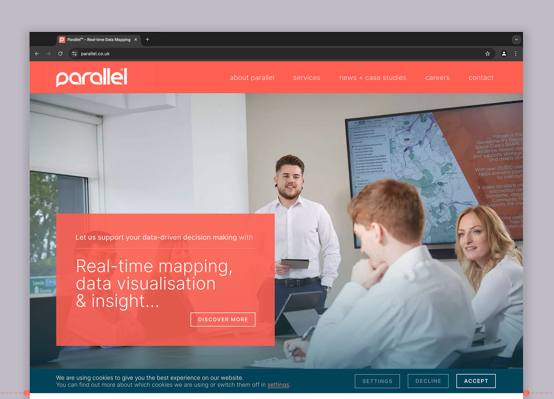
Parallel is a data mapping / insight company.
Working with large public and private sector organisations to empower their strategic decision making via ‘real-time’ data mapping.
- Client
- Parallel
- Sector
- Tech / Data Insight / SaaS / Digital
- Services
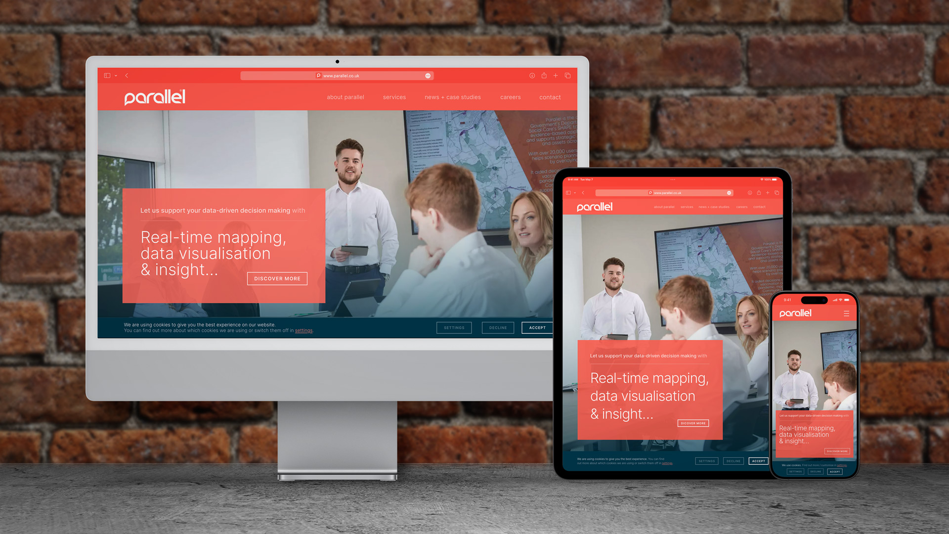
- Brand Design, Bespoke Typography, UX Design System
- Brief
- Parallel™ sought to update its brand yet retain their familiarity with a loyal customer-base.
- Requirements
- The new identity needed to better reflect Parallel... a tech company that provides bespoke SaaS solutions to large-scale corporate and public sector bodies.
- Solution
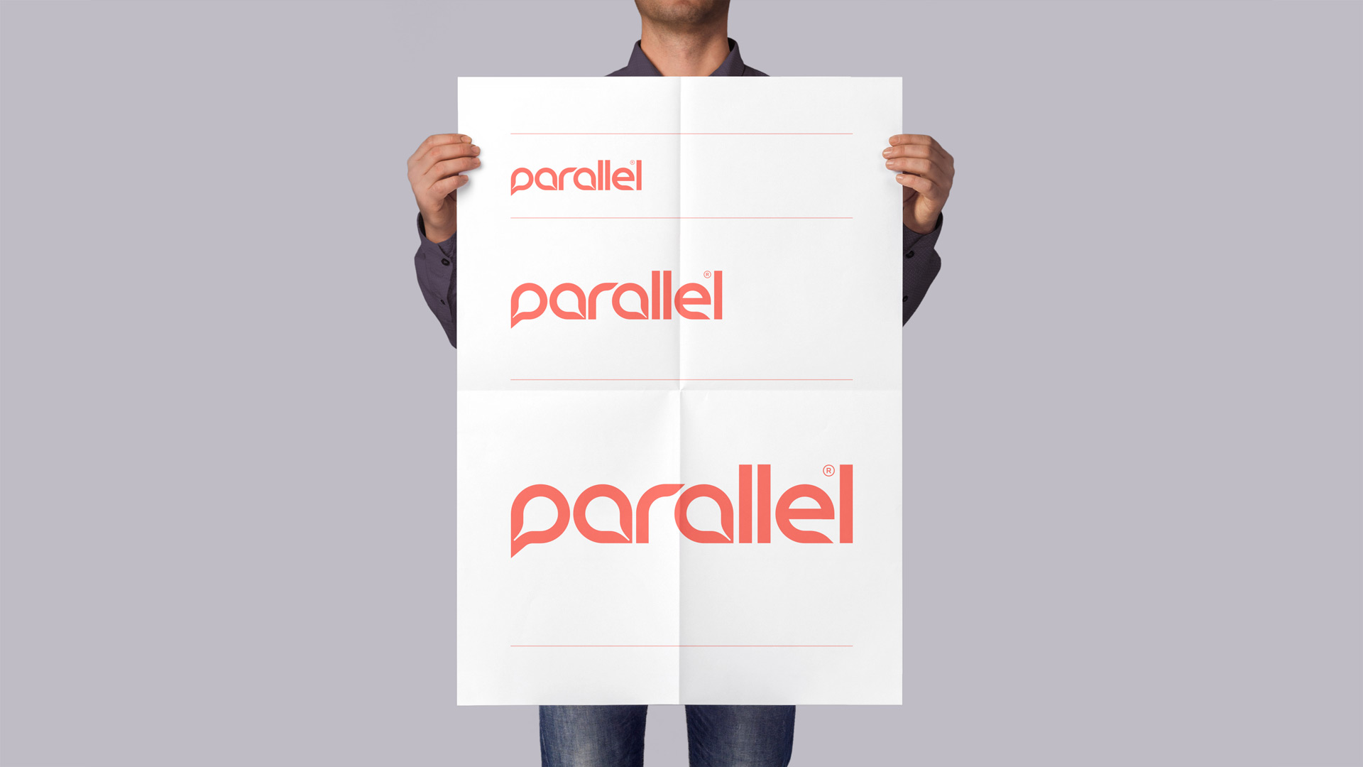
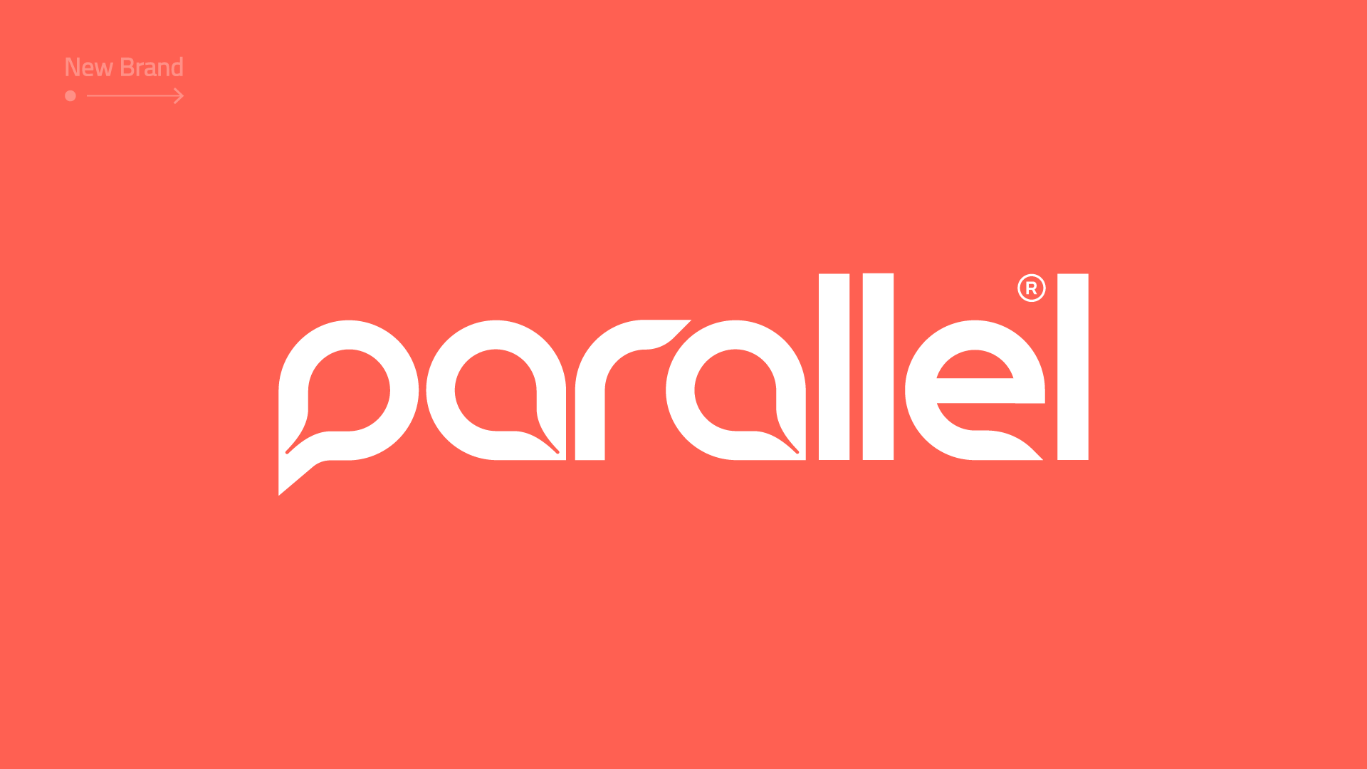
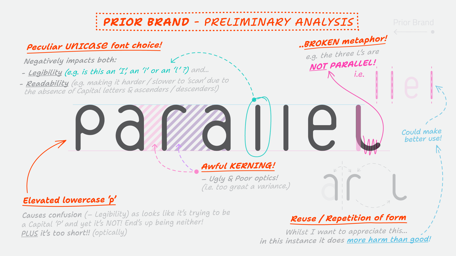
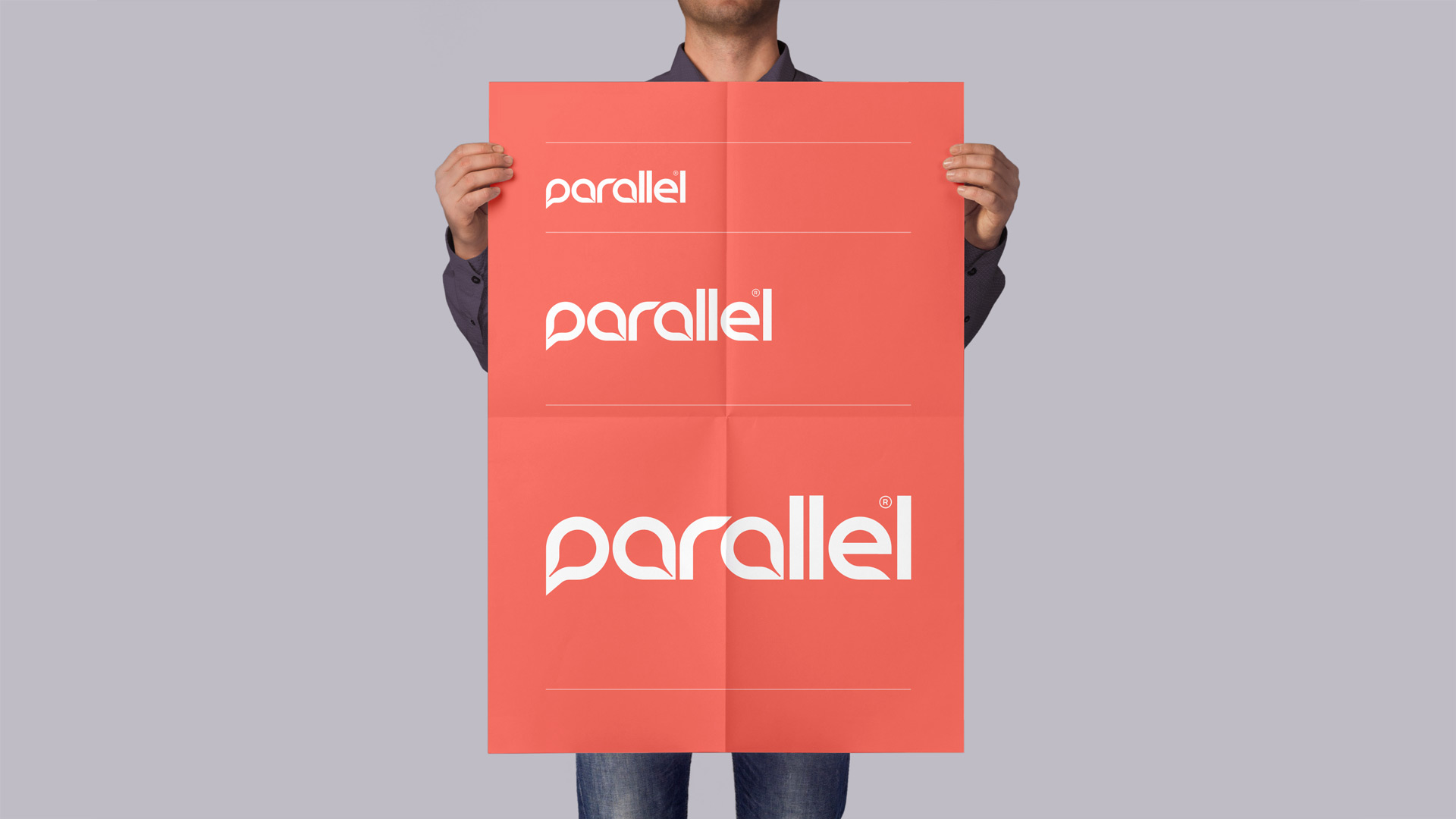
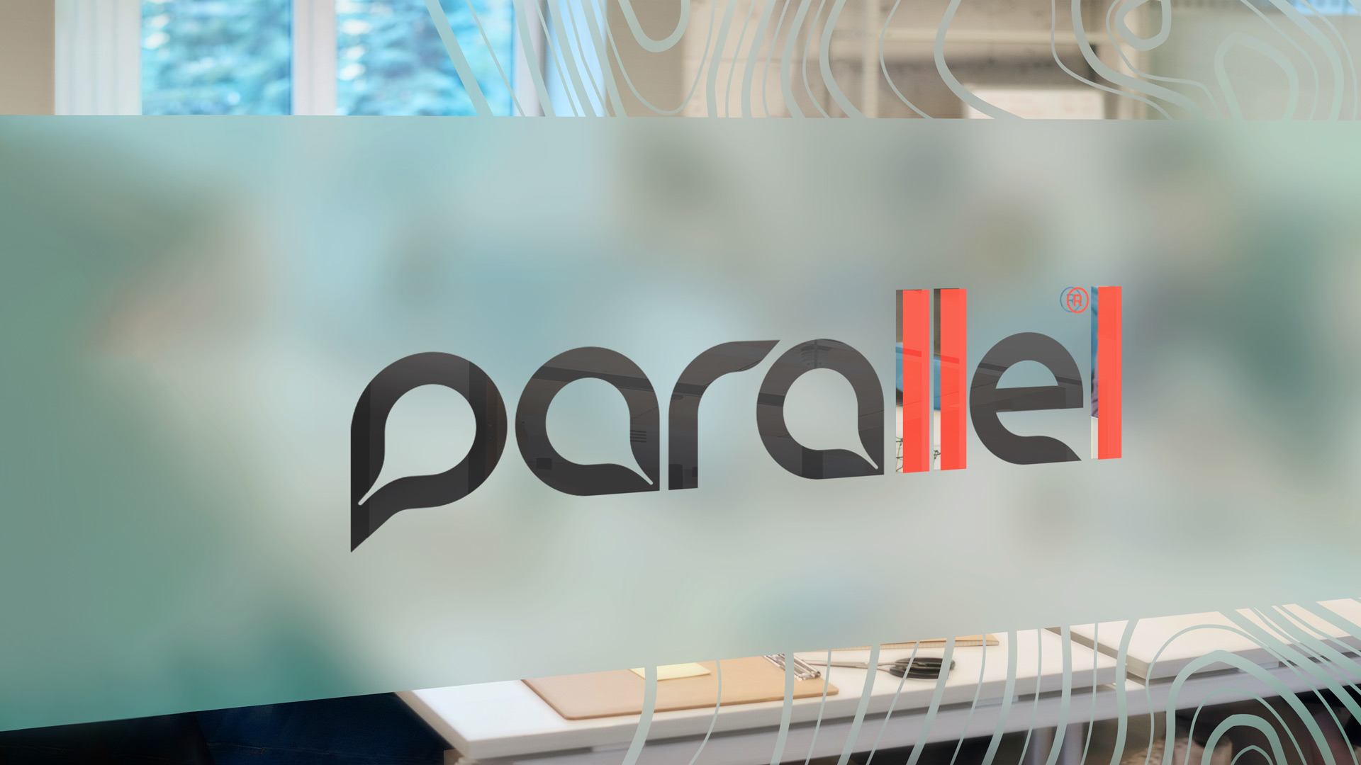
- Re-aligning parallel’s visual identity began with a critical analysis of the current offering, a review of their client list and a desire to find a metaphor to convey the power of data insight.
- The result is cleaner, scannable and infers the process of data mapping itself; dynamic ‘callouts’ emerging to ‘pin-point’ insights. An allusion, re-enforced through a collection of animated variations upon a theme.
Keynotes:
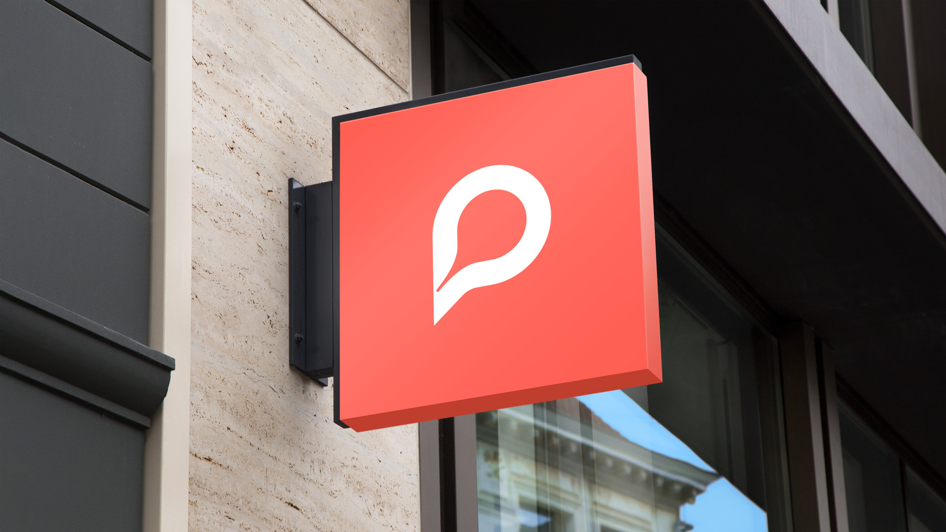
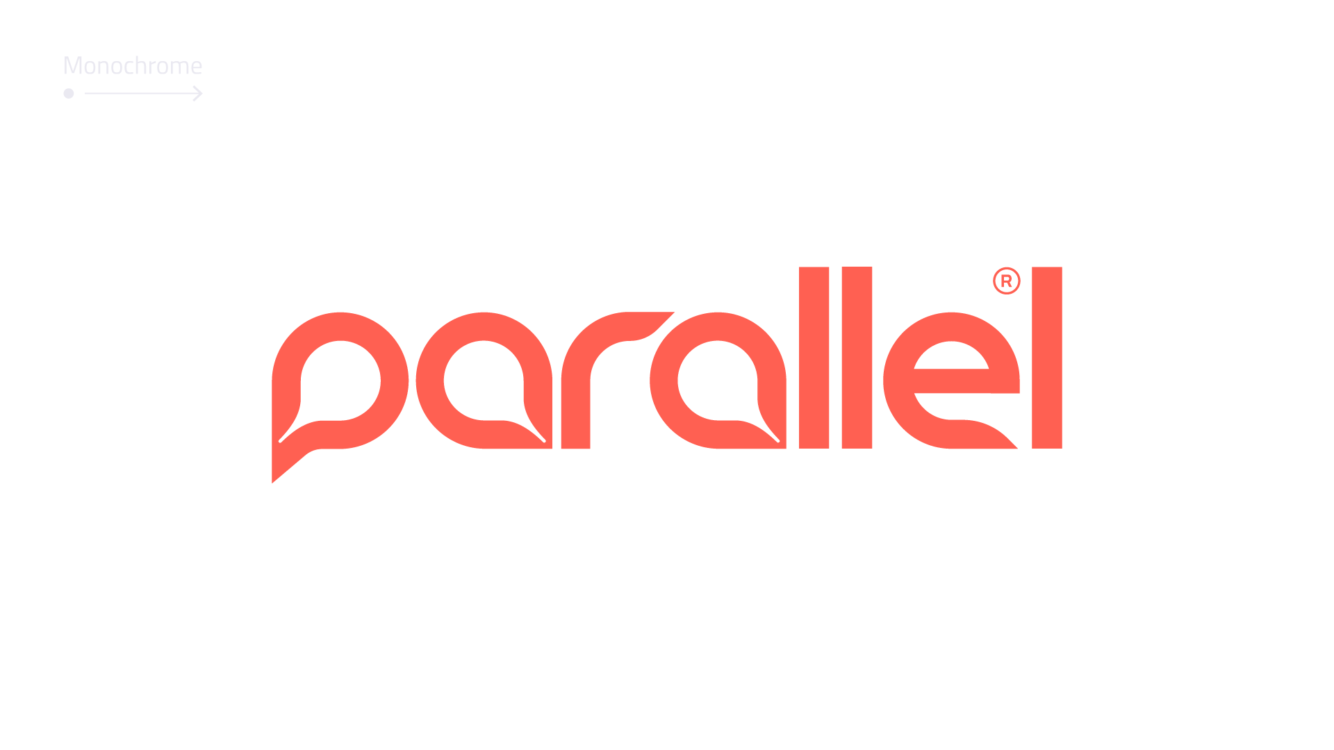
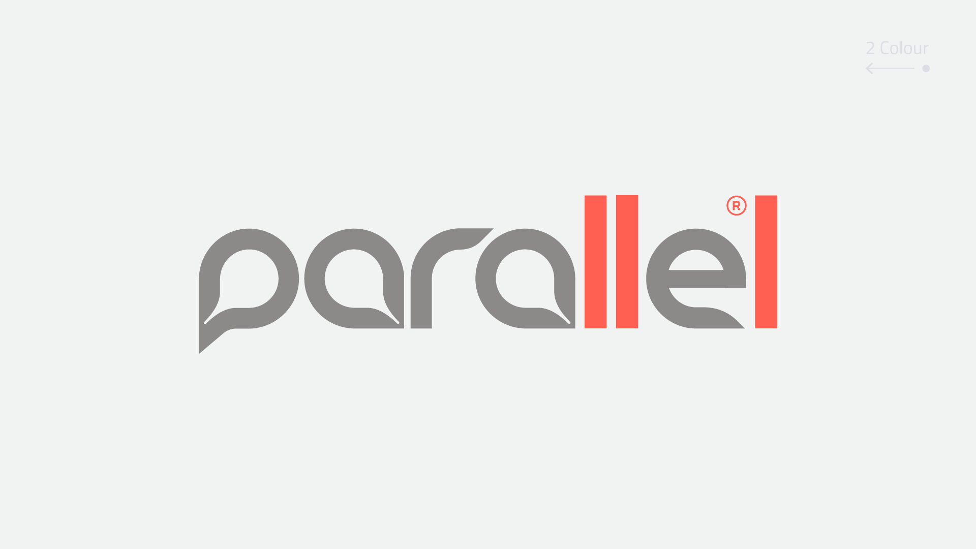
- Instantiated parallel forms (throughout the identity)
- Dramatically improved legibility (brand cognition)
- Crafted ‘house style’ (singular 'look n feel')
- Increased typographic readability (Brand + Web + UX)
- Bespoke UX design system ('atomic' hierarchy & library)