Synergy Acutherapy
Pin-pointing the modern face of acupuncture.
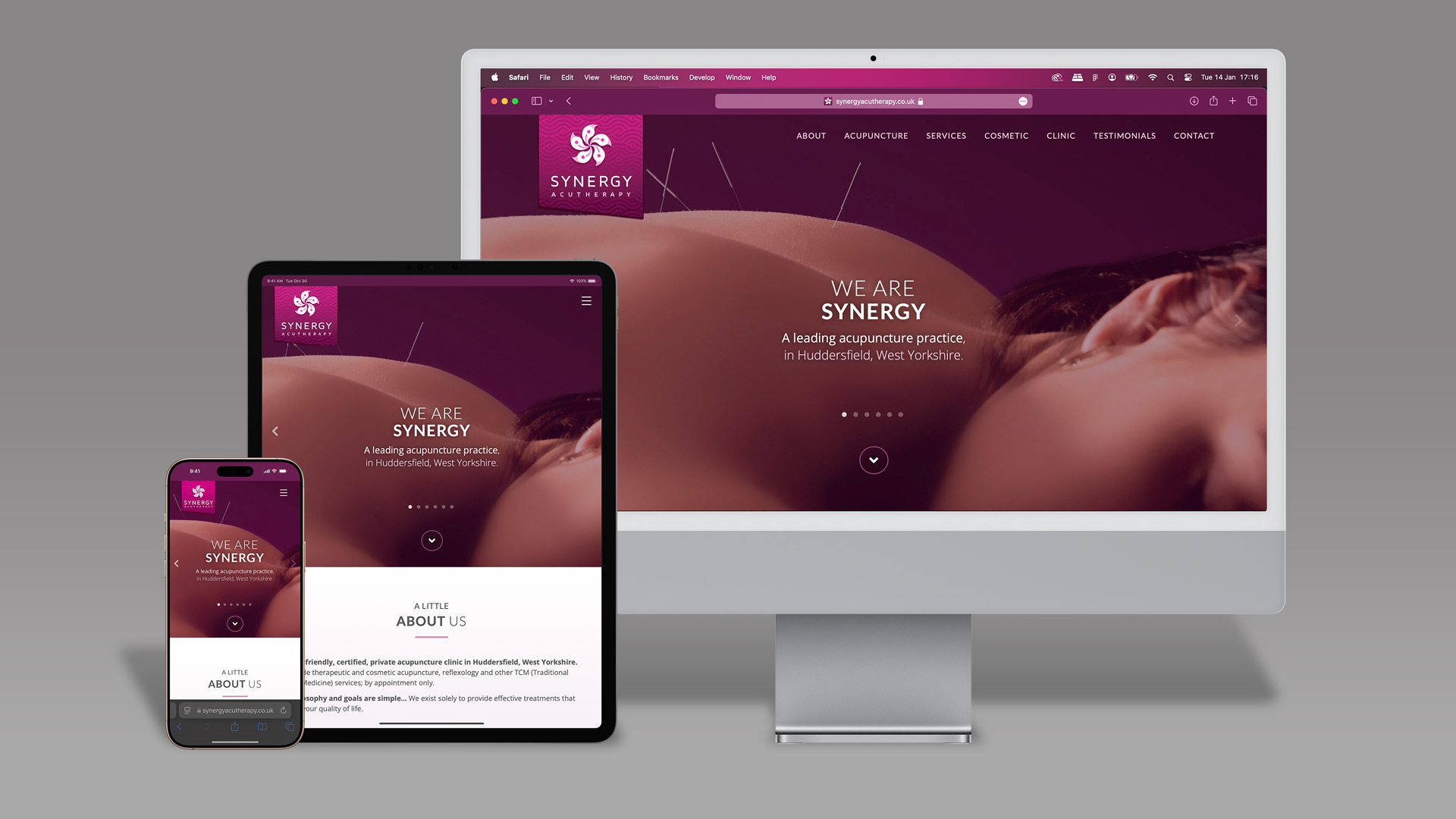
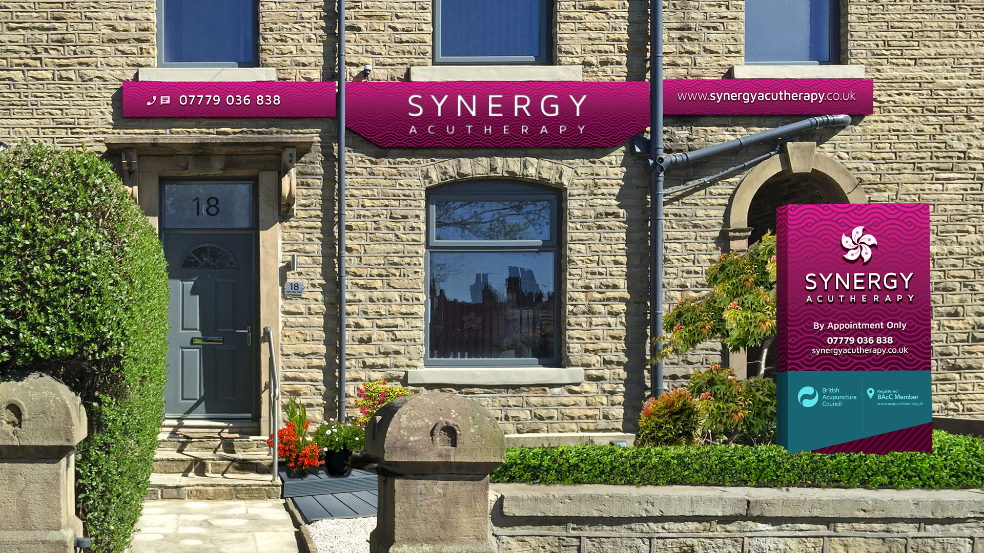
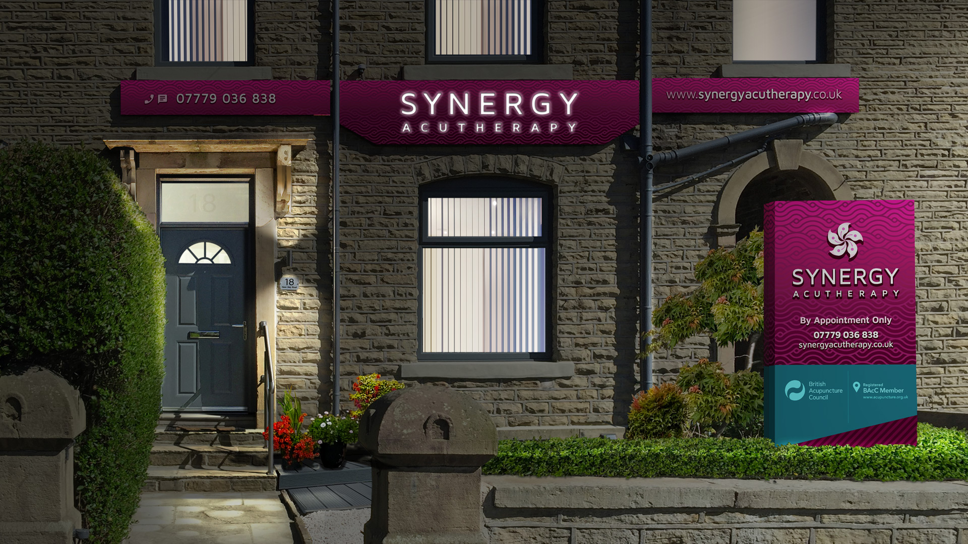
Synergy required a clinical brand, to project their professional, client-centric and friendly personality to new and existing clientele.
- Client
- Synergy Acutherapy
- Sector
- Private Healthcare / Acupuncture Clinic
- Services
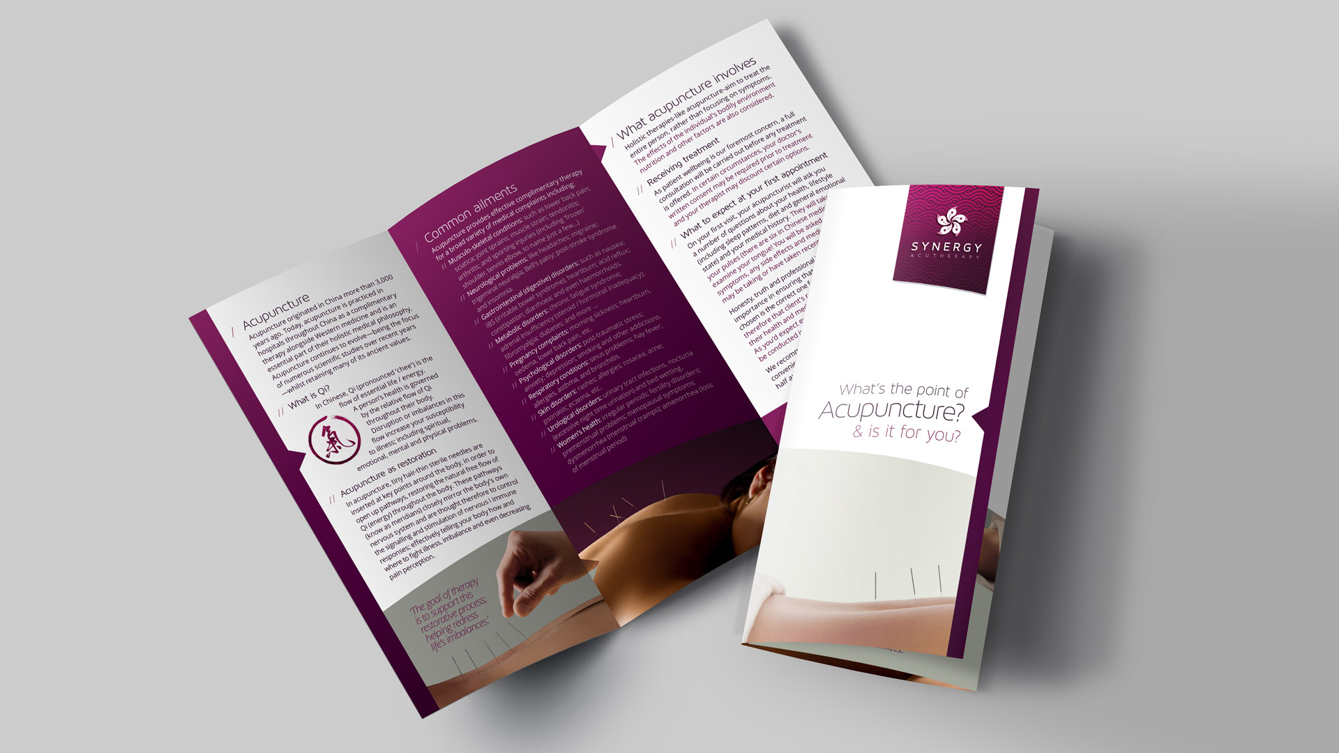
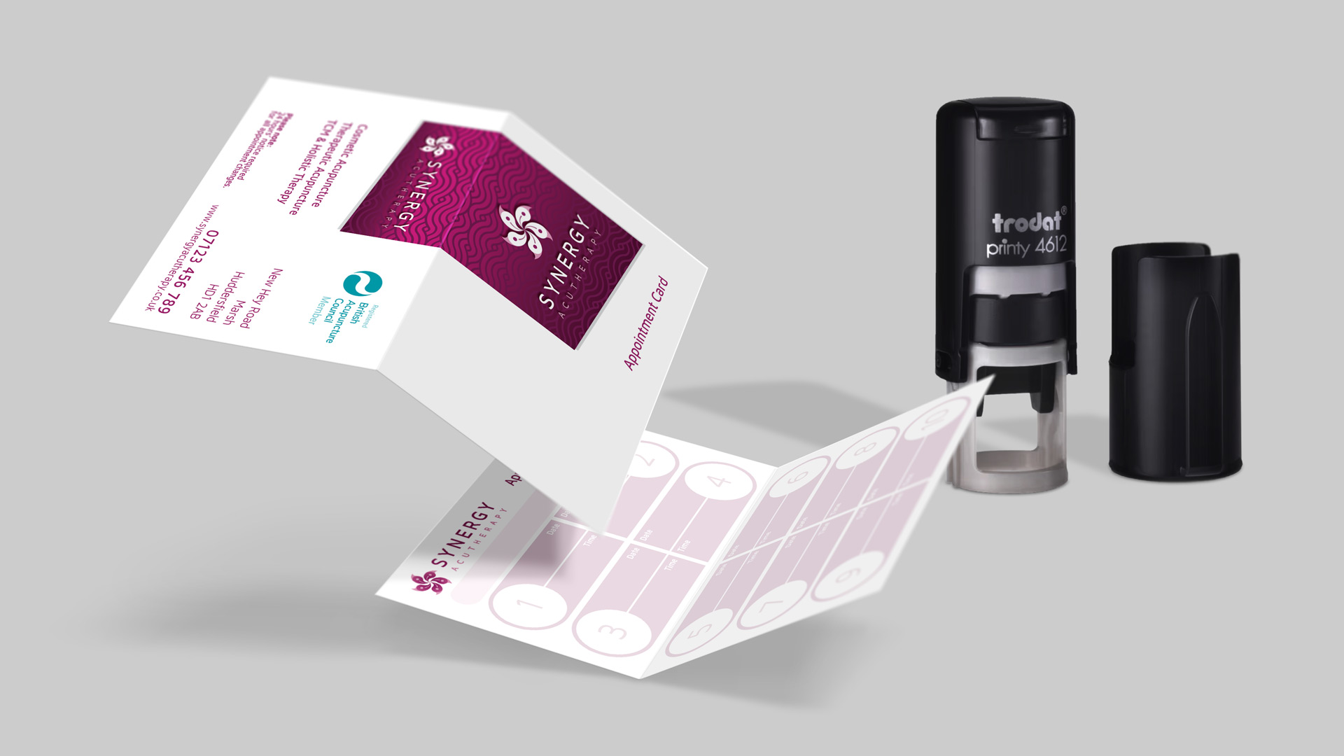
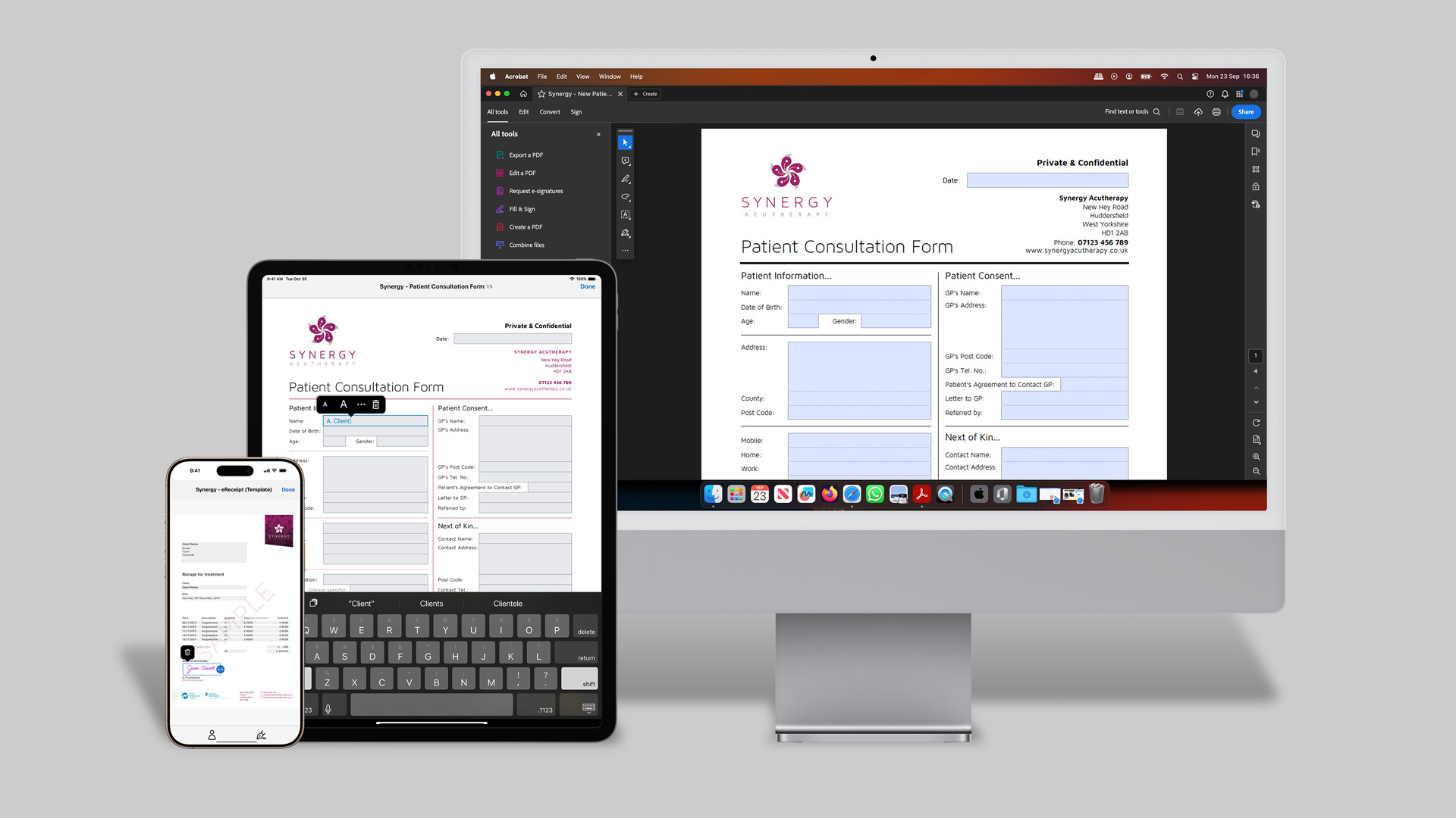
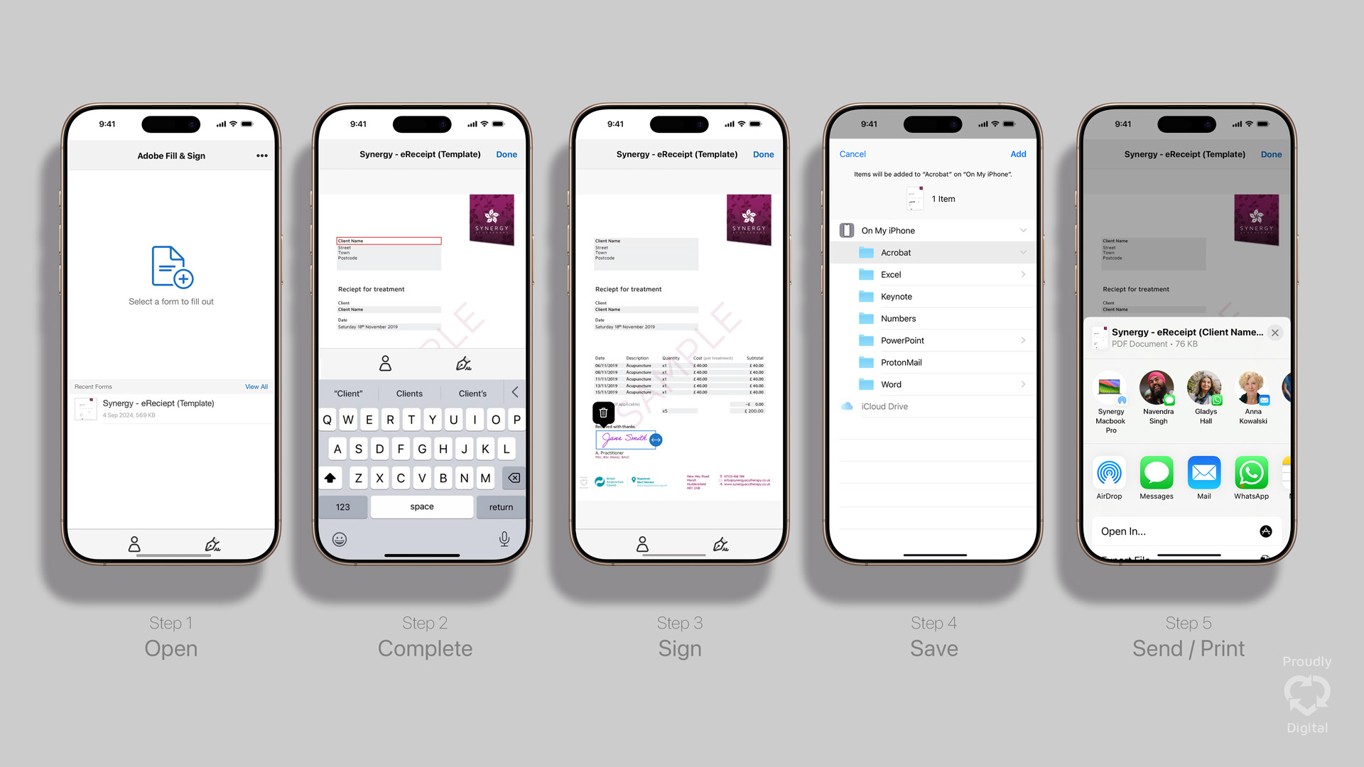
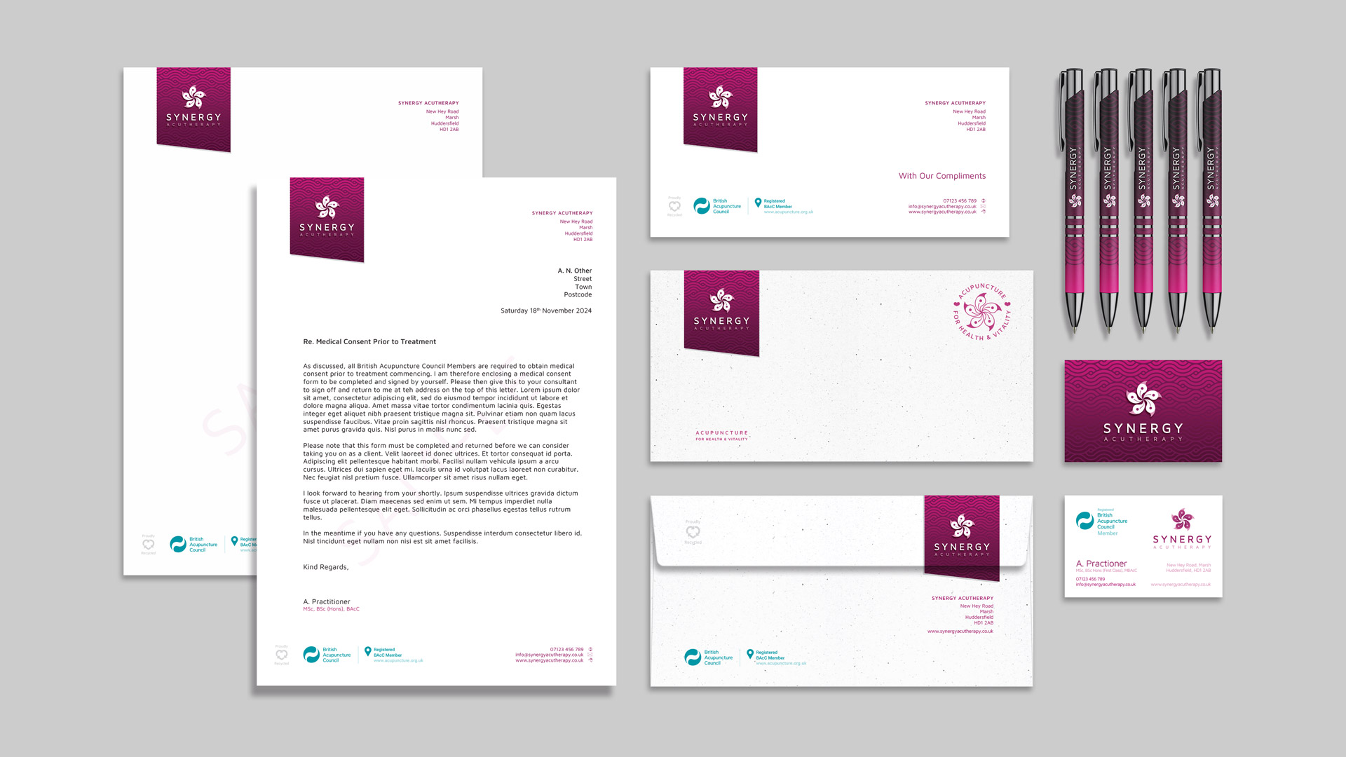
- Brand Origination, Signage, Interior Design, Print, Digital & UX


- Brief
- Our client wanted a ‘beautiful’ brand befitting their customer-focused private acupuncture clinic.
- Requirements
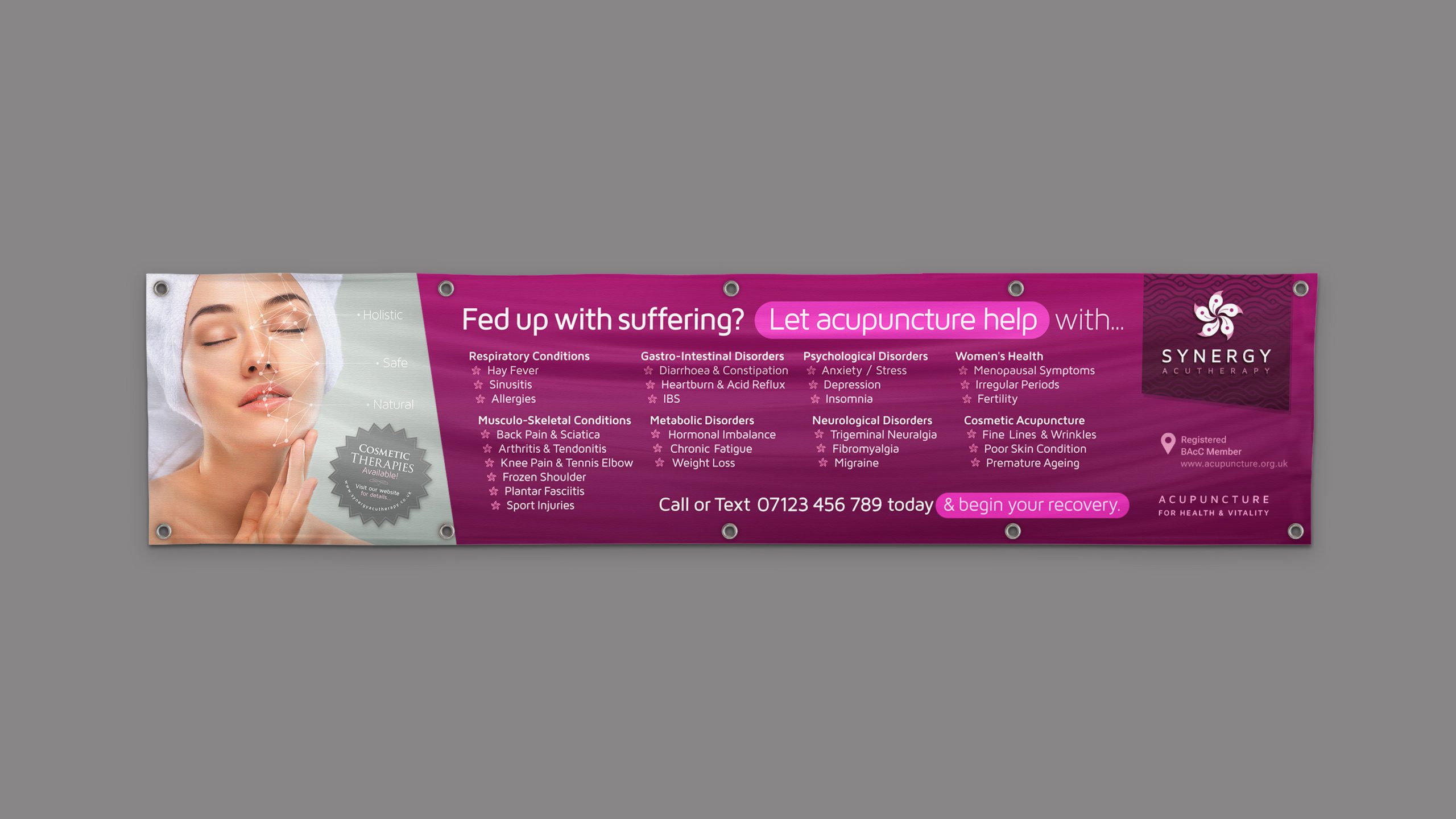
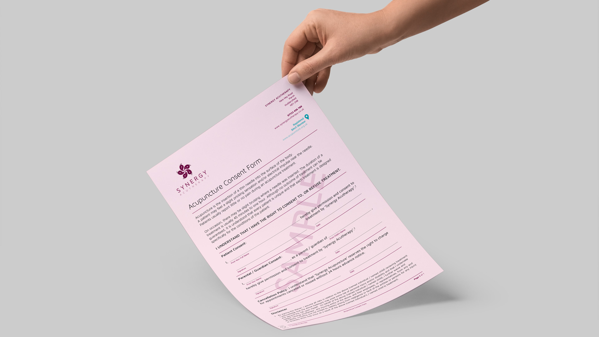
- A bespoke and visually unified appearance was required across all channels (physical, digital, print, etc.). Whilst Traditional Chinese Medicine is an ancient practice, Synergy does not live in the past. It represents the modern (Western medical) face of therapeutic and cosmetic acupuncture and the brand should reflect this dichotomy. The identity should be as clean, progressive and grounded as the practice.
- Solution
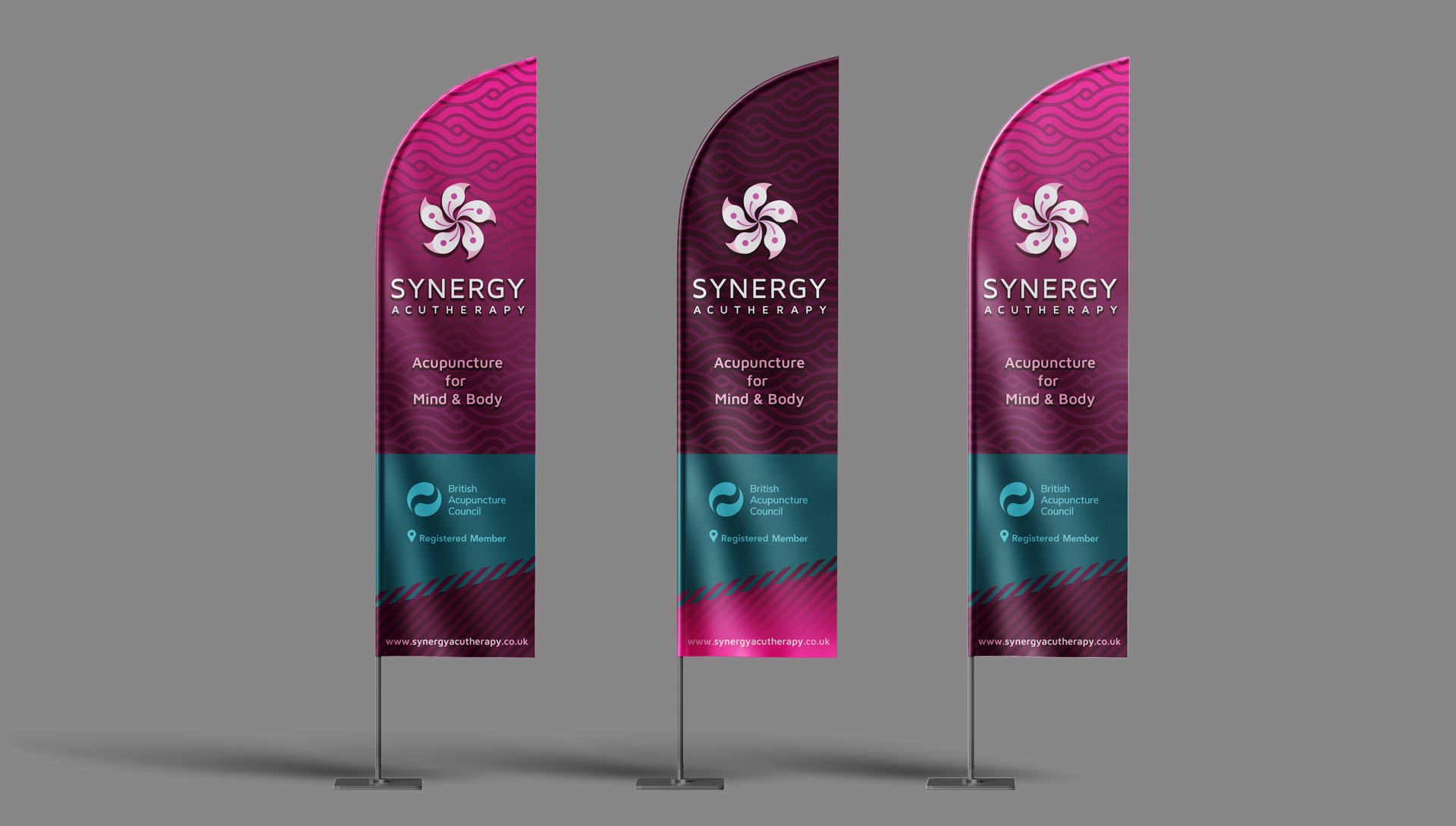
- The name Synergy was chosen in discussion with the client. It represents the symbiosis of client and practitioner, ancient and modern as complimentary parts of a greater whole.
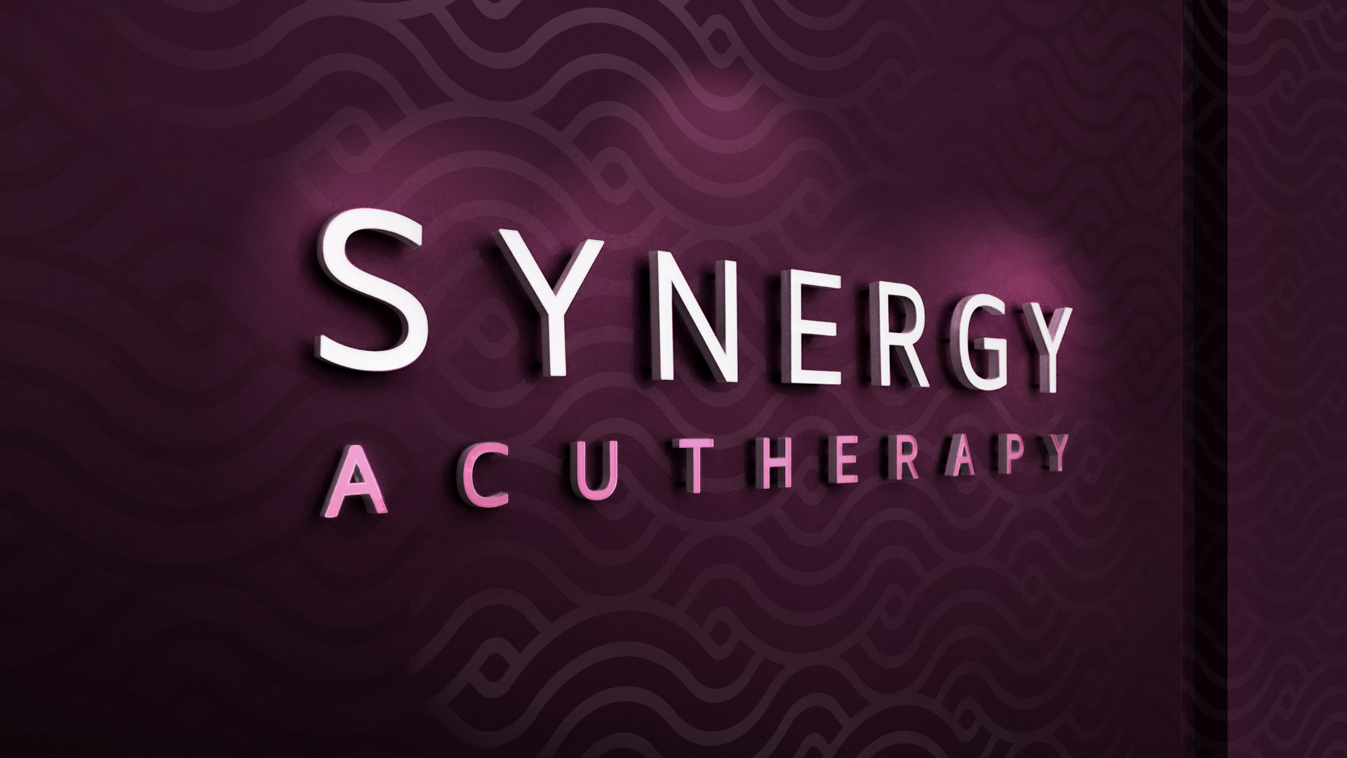
- The design is warm, friendly, mildly feminine and reassuring. The brand icon is an amalgam of forms taken from the ancient ‘yin-yang’ symbol fused with the flag of Hong Kong (a nod to the client’s roots).
Keynotes:
- Brand origination & refresh ('start-up' brand + update)
- Crafted 'centripetal' marque (dynamic asymmetry)
- Bespoke ‘boutique styling' (brand + interior + digital)
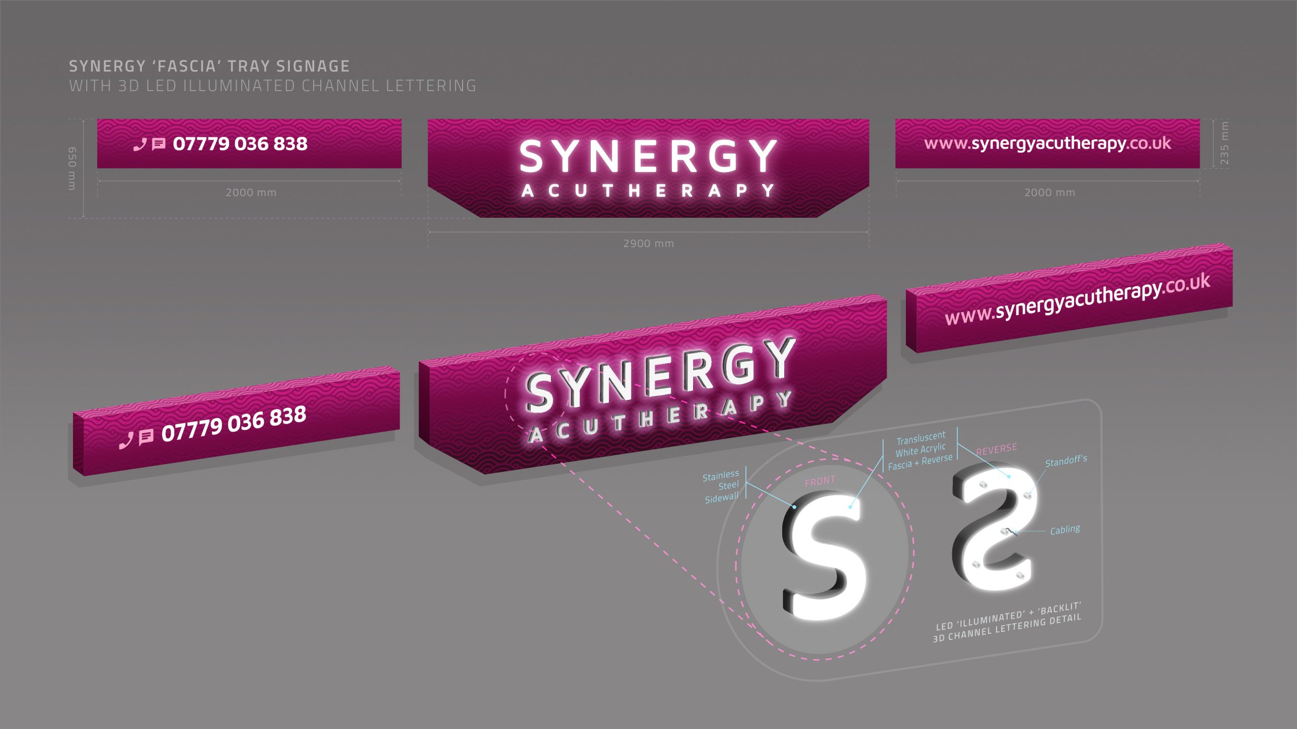
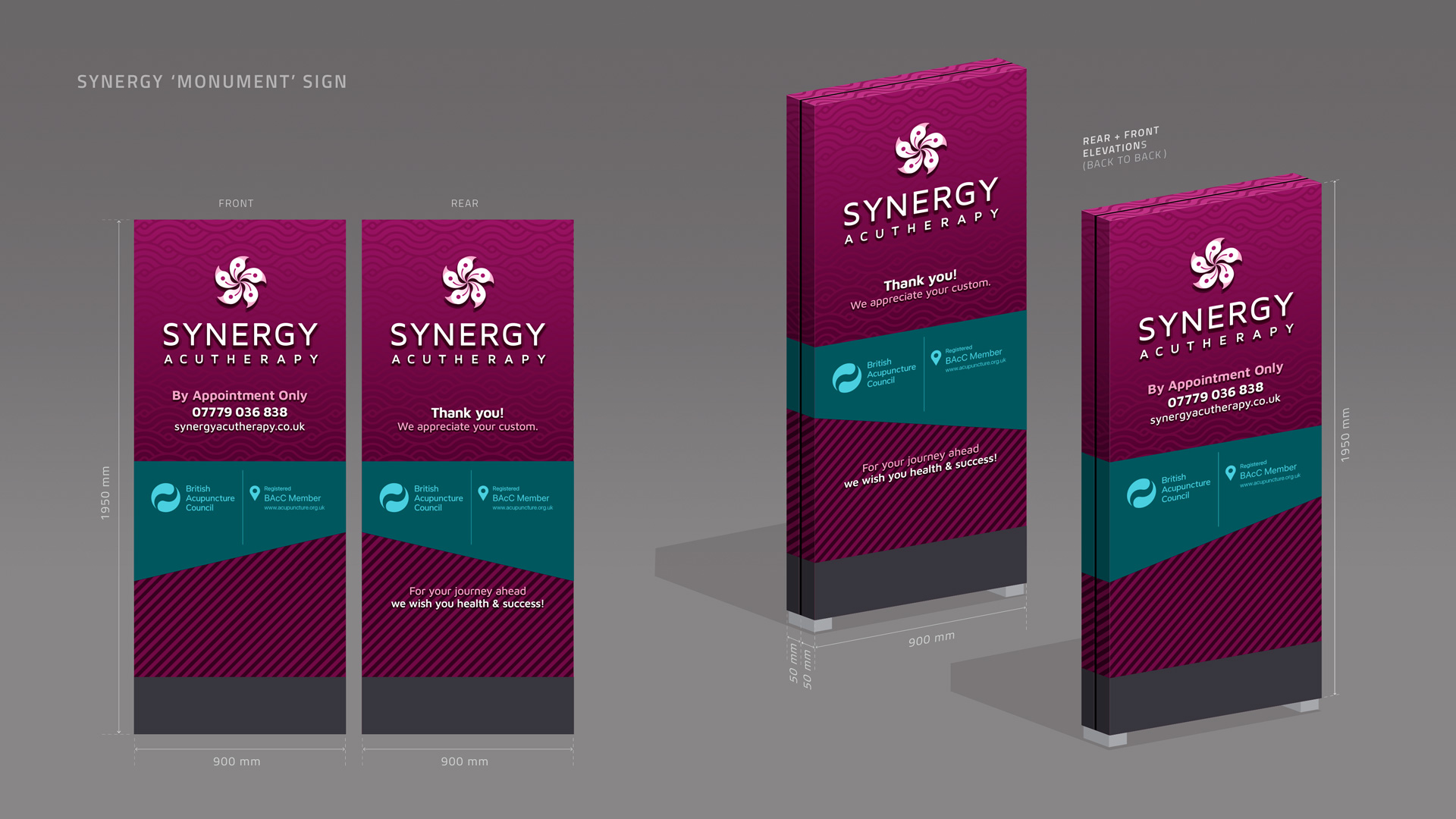
- Legibility of brand signage (on major thoroughfare)
- Custom ‘synergistic wave’ motif (illustrates 'Qi')